ascaso shop

ECOMMERCE / COFFEE SHOP

Creating a more intuitive and engaging e-commerce experience for coffee enthusiasts.

About the project

Ascaso is a premium coffee machine manufacturer known for combining industrial craftsmanship, innovation and contemporary design.

The project focused on rethinking key areas of the e-commerce experience, with the goal of helping users better understand the product catalogue, compare models and make confident purchasing decisions while maintaining the brand’s premium positioning.

My Role

Product Designer

Duration

8 Weeks

Industry

E-commerce

What I worked on this project

UX Audit

Benchmarking

UI Design

Information Architecture

Wireframes

Visit the website

CHALLENGE

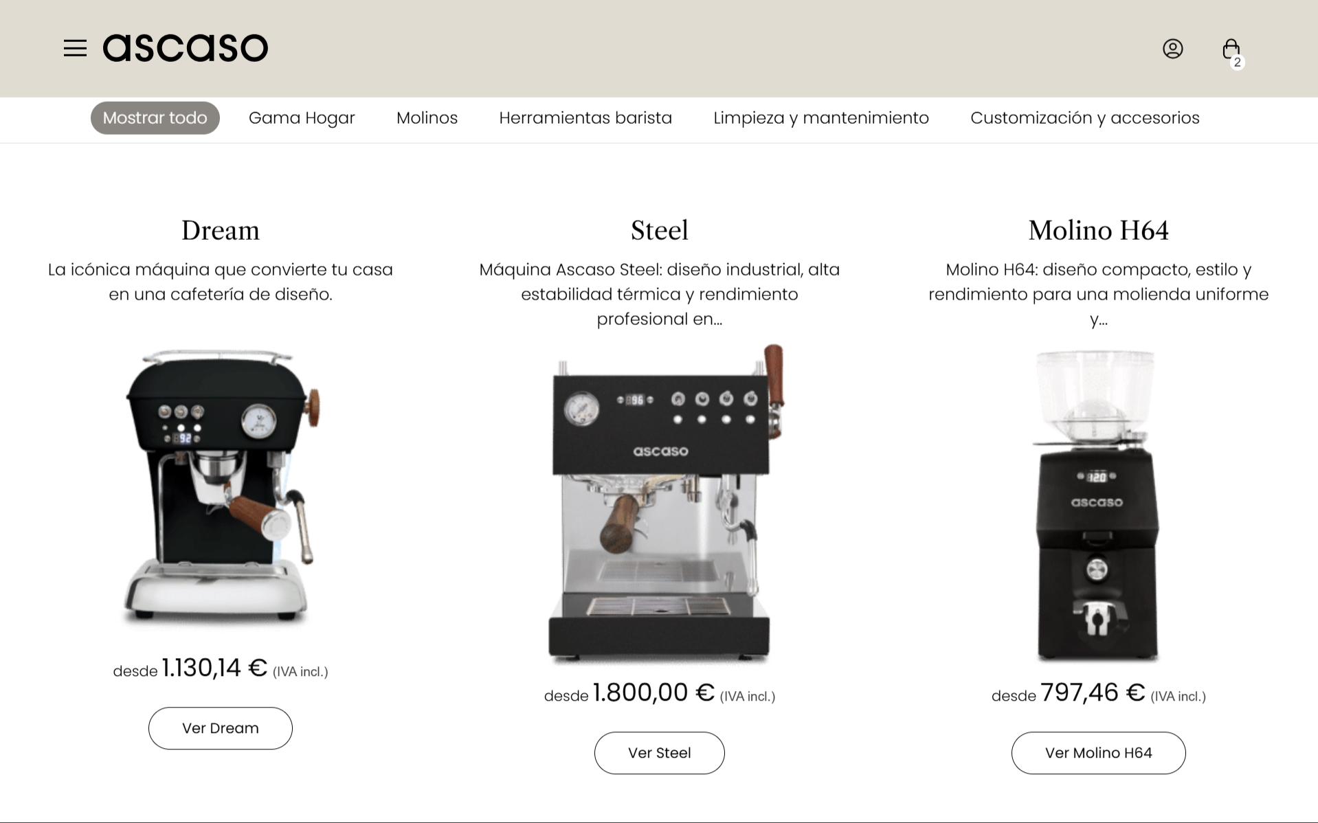
The existing experience provided access to a wide range of products, but users faced challenges when exploring the catalogue, comparing models and understanding the differences between product categories.

The goal was to simplify product discovery, improve navigation and create a clearer purchasing journey without compromising the premium perception of the brand.

Understanding

Ascaso's Brand Ecosystem

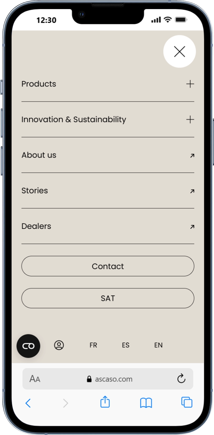
Before designing the e-commerce experience, I analysed Ascaso’s existing digital ecosystem to understand how the brand communicated its values, products and positioning across different touchpoints.

The analysis focused on identifying recurring visual patterns, navigation structures, content hierarchy and brand attributes that could be translated into the shopping experience.

This phase helped establish a clear connection between the corporate website and the future e-commerce platform, ensuring consistency while adapting the experience to the specific needs of online purchasing.

01. TYPOGRAPHY

For the coffee lovers,

since 1962.

There are things that cannot be described in words. Like the aroma of freshly ground coffee. Or the sensation evoked by a good design. It is a moment, an instant, a feeling, sometimes incomprehensible.

Libre Carson

Aa

Heading

Poppins

Aa

Text

02. COLOUR PALETTE

#E2DCD3

#4A94FF

#000000

#5A5A5A

Usage

70 %

Neutrals

25 %

Warms

5 %

Accent

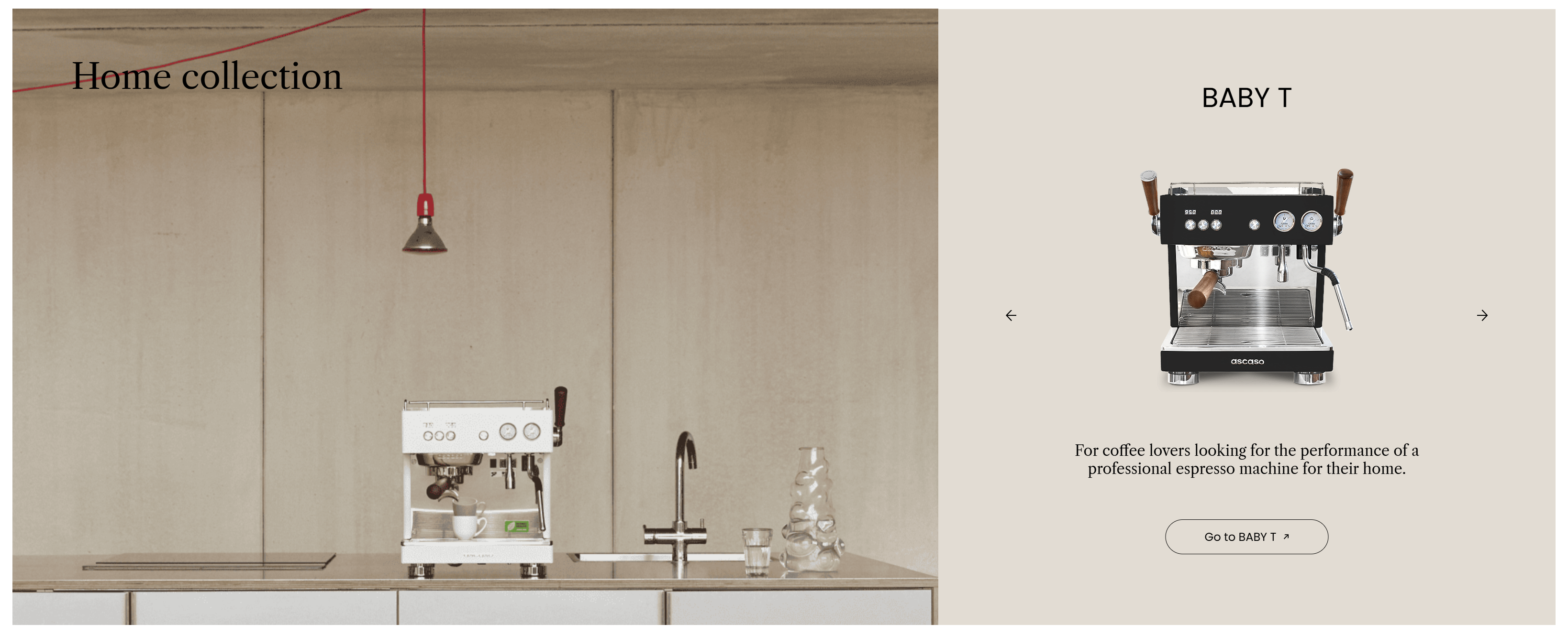
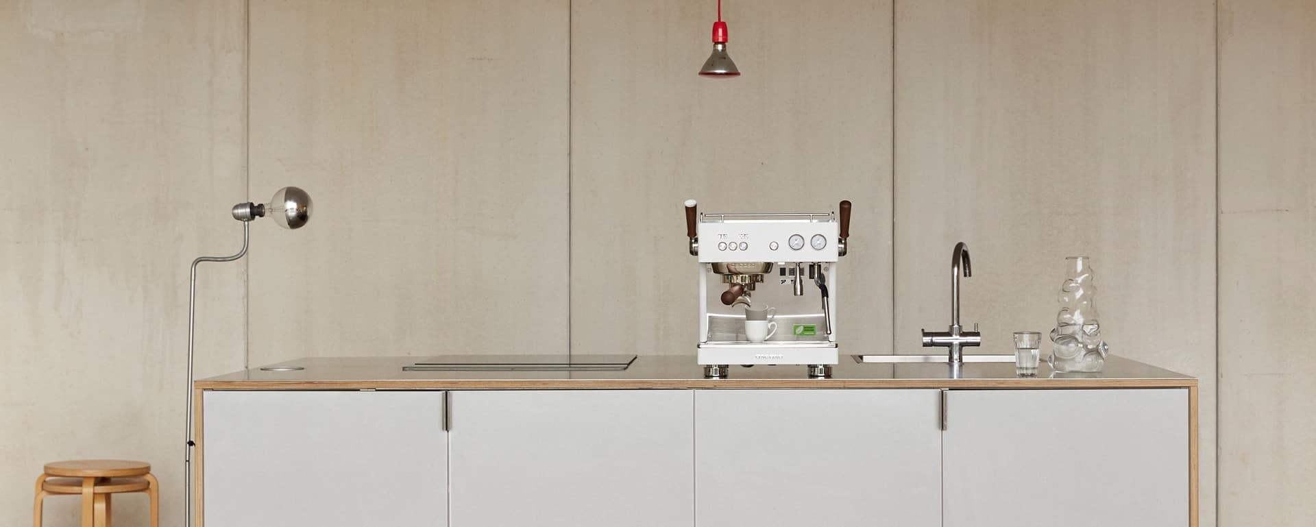
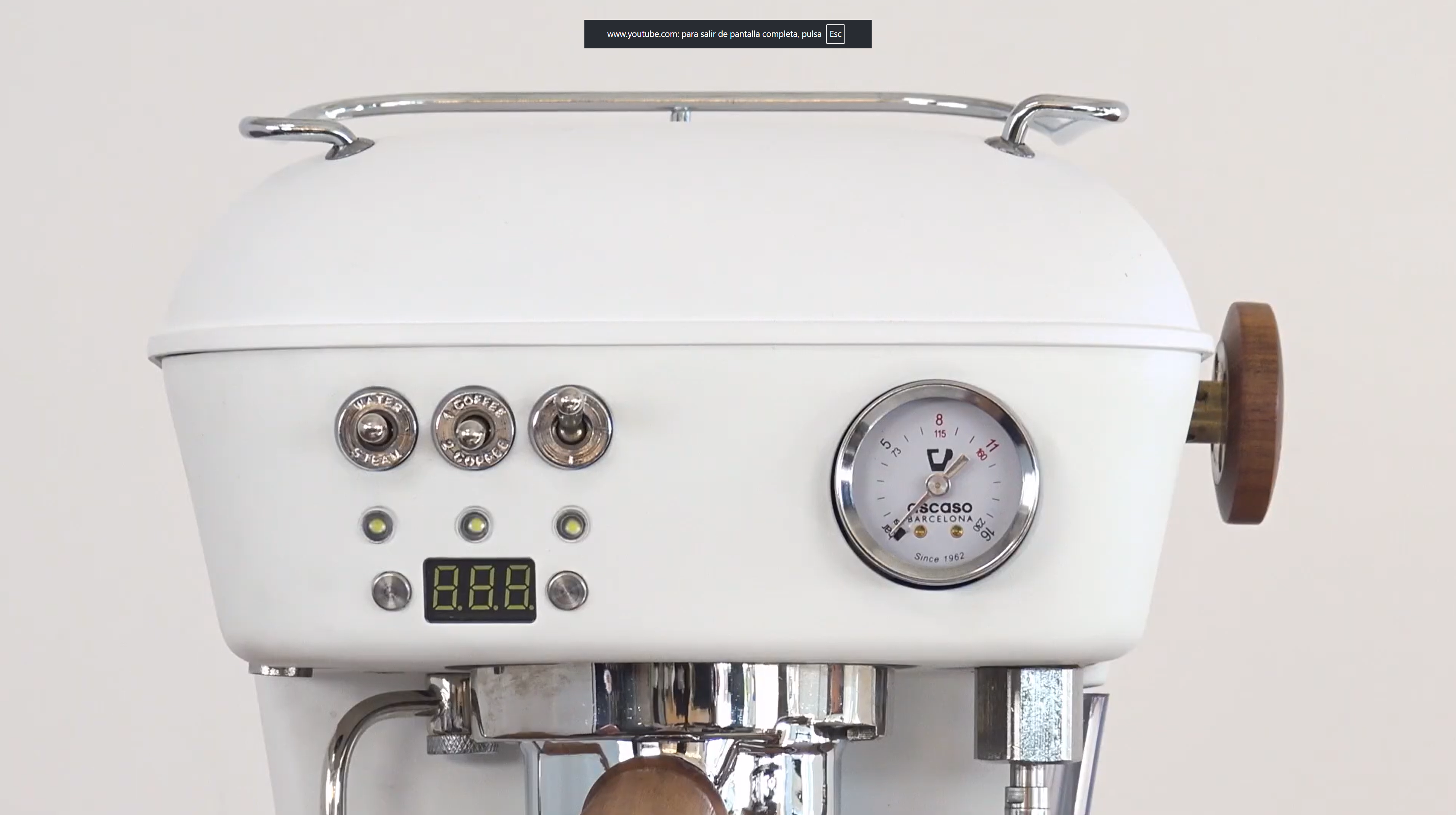
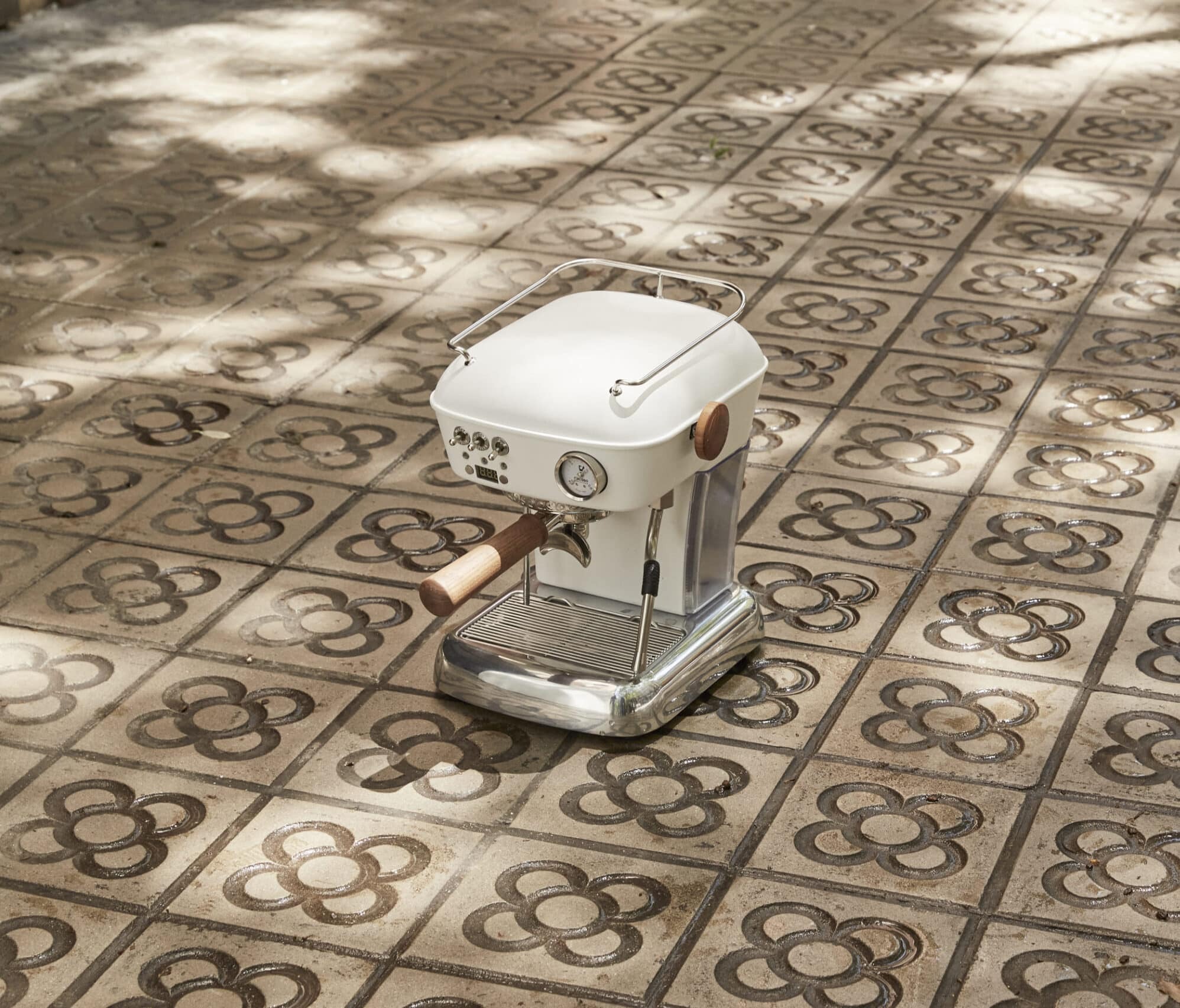
03. PRODUCT PHOTOGRAPHY
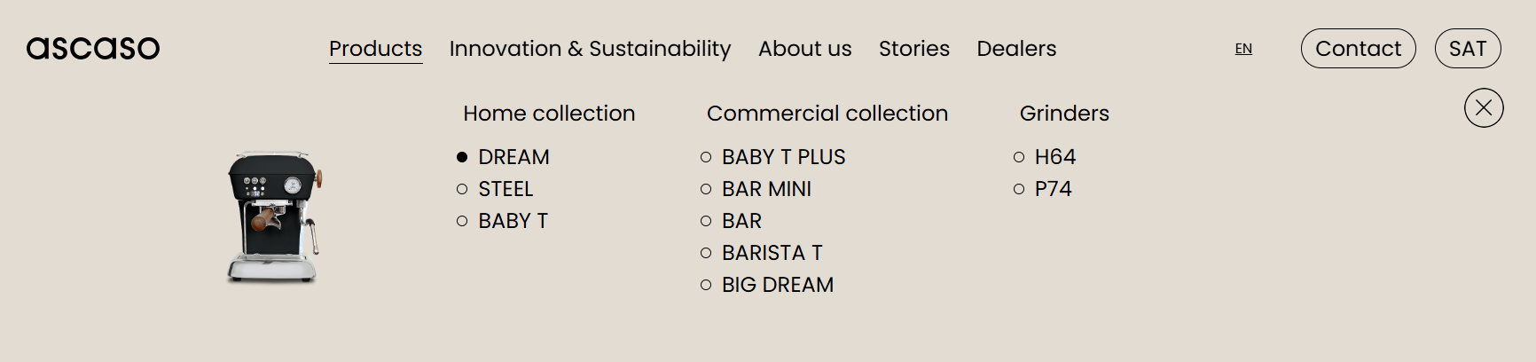
05. NAVIGATION PATTERNS

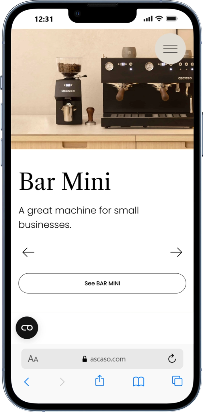
06. UI COMPONETS

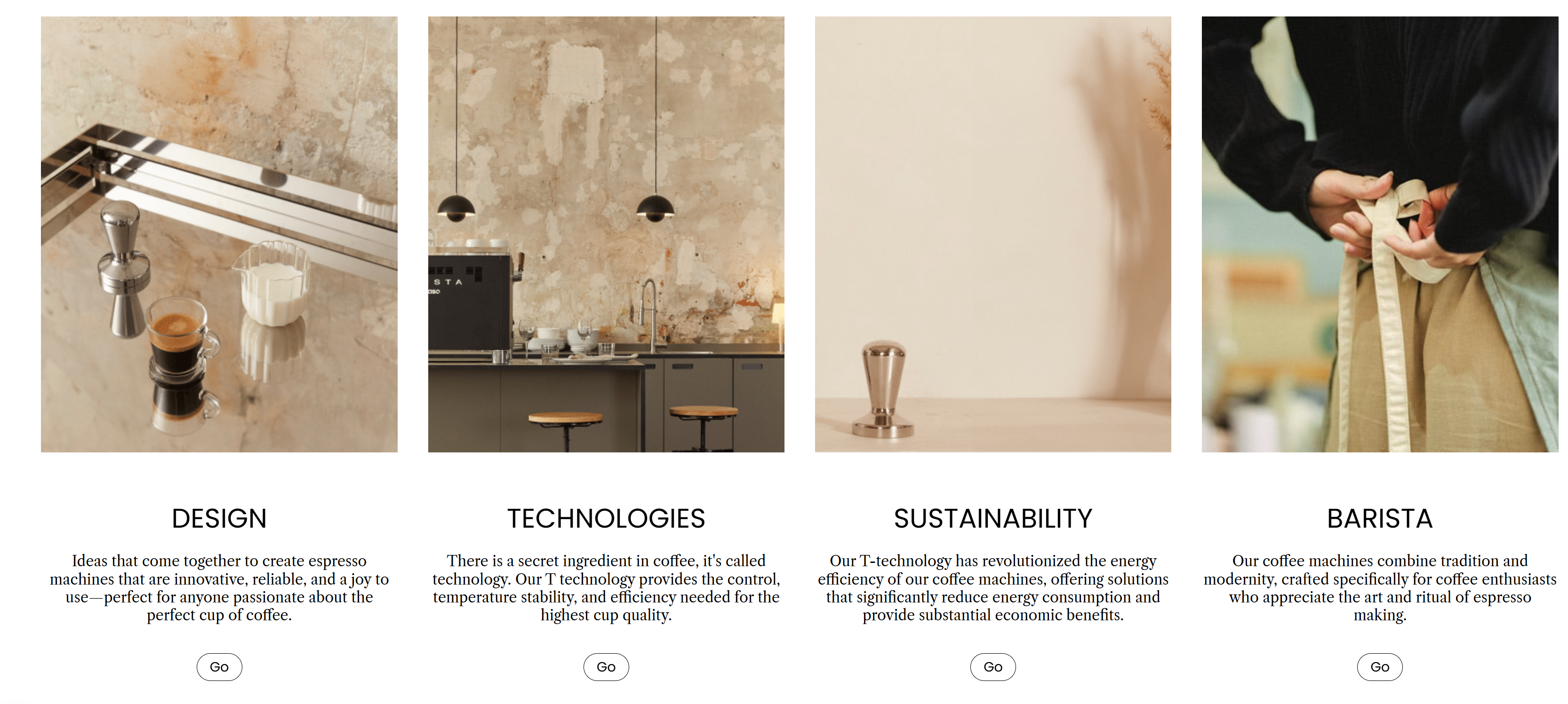
BARISTA

Our coffee machines combine tradition and

modernity, crafted specifically for coffee

enthusiasts who appreciate the art and ritual of

espresso making.

Go

Go

Go to STEEL

Go to STEEL

design

references

Learning from industry leaders and curated references.

To better understand user expectations and identify proven interaction patterns, I analysed a selection of e-commerce experiences recommended by the client alongside additional references discovered during the research phase.

Rather than replicating existing solutions, the goal was to understand how leading brands approached product presentation, navigation and purchasing journeys. These insights helped shape key areas of the Ascaso experience while maintaining a visual language aligned with the brand's identity.

design

references

Learning from industry leaders and curated references.

To better understand user expectations and identify proven interaction patterns, I analysed a selection of e-commerce experiences recommended by the client alongside additional references discovered during the research phase.

Rather than replicating existing solutions, the goal was to understand how leading brands approached product presentation, navigation and purchasing journeys. These insights helped shape key areas of the Ascaso experience while maintaining a visual language aligned with the brand's identity.

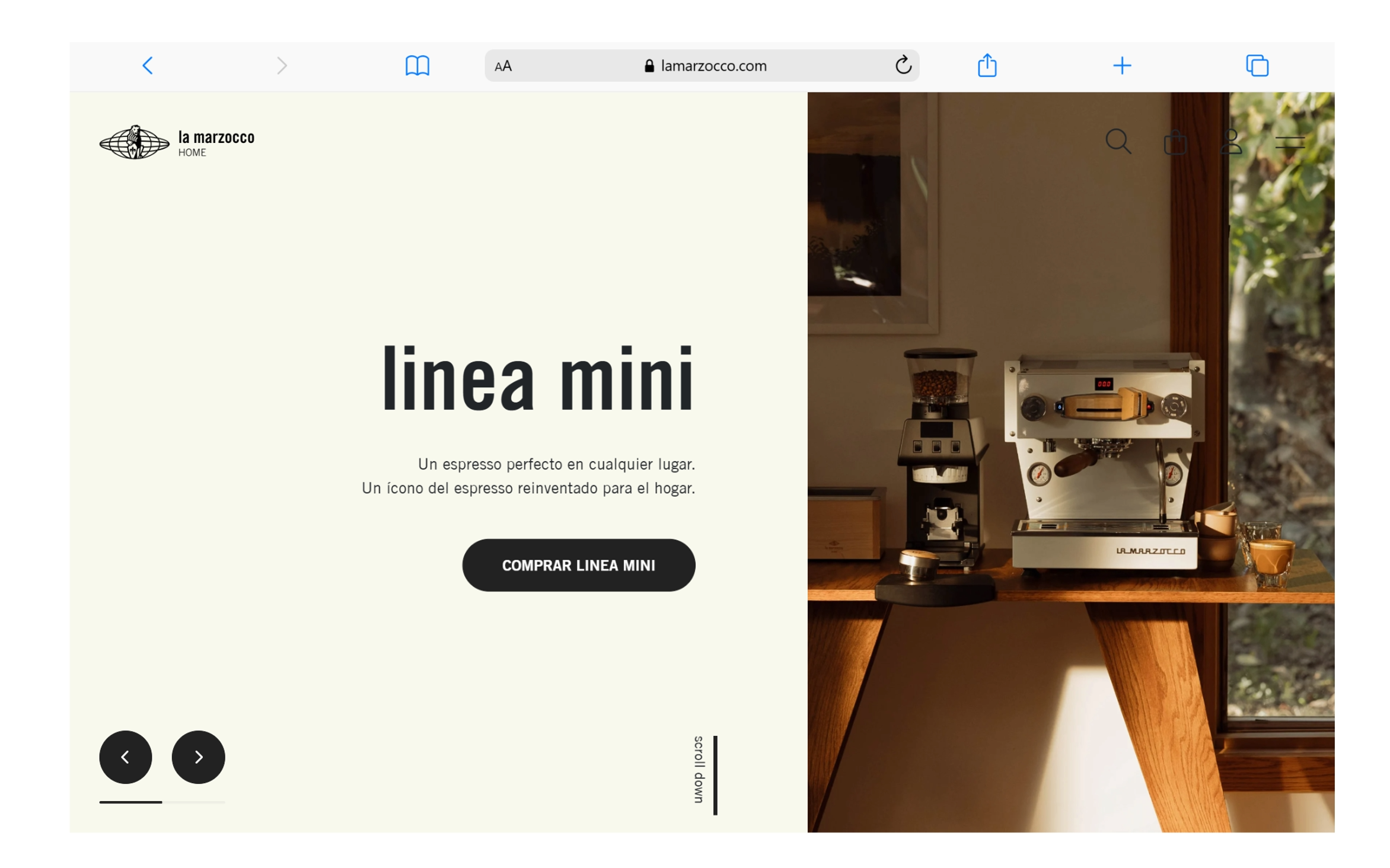
01

La Marzocco

www.lamarzocco.com

Product storytelling and homepage composition.

The visual hierarchy, use of large product imagery and editorial layout helped define the structure of the Ascaso e-commerce homepage.

This reference demonstrated how premium products can be presented through storytelling while maintaining a clear path to exploration and purchase.

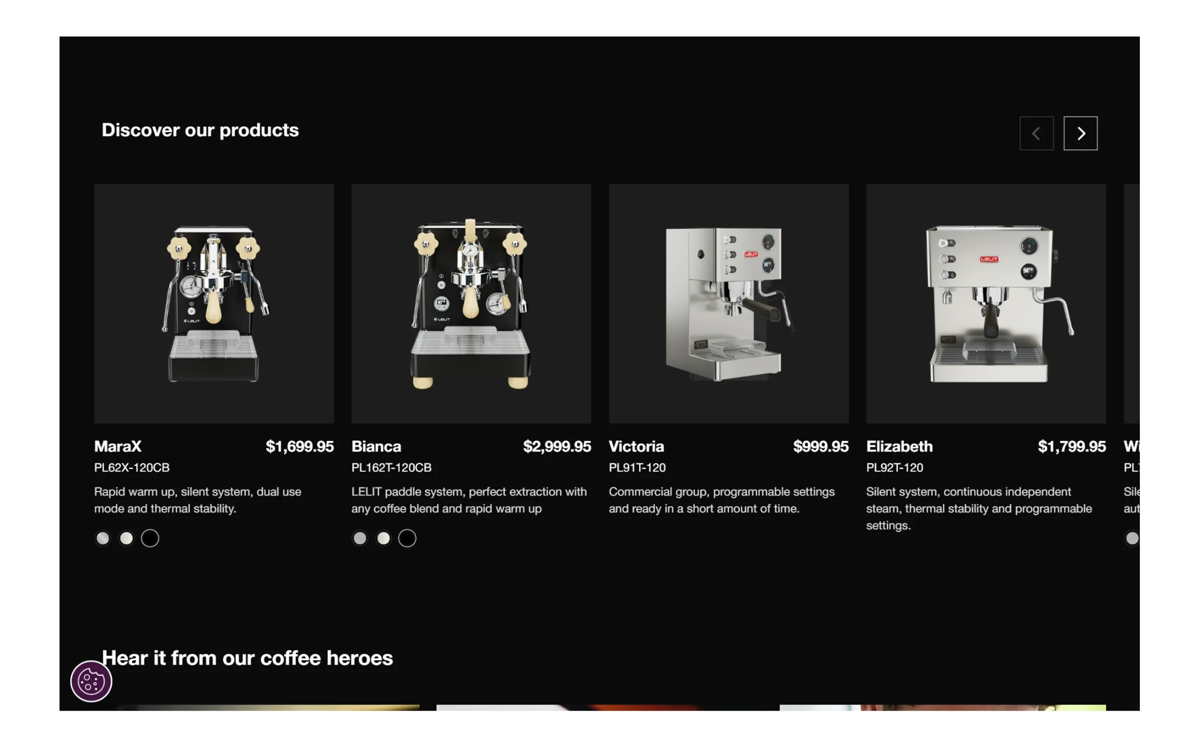
02

Lelit

www.lelit.com

Product card structure, information hierarchy and colour selector interactions.

This reference provided valuable insights into how technical products can be organised and compared efficiently.

The product card layout, content prioritisation and colour selection patterns inspired several interaction decisions within the catalogue experience.

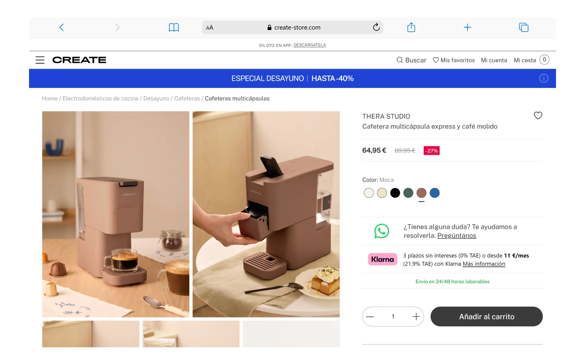
03

Create

https://www.create-store.com/es/

Minimal product presentation and clean purchasing experience.

Create's approach demonstrated how a reduced visual language can help users focus on the product itself.

The product detail page became a key reference for simplifying information, reducing visual noise and creating a more intuitive shopping experience.

KEY FINDINGS

01

Editorial Product Presentation

Leading brands use large imagery and thoughtful composition to highlight product craftsmanship and reinforce premium positioning.

02

Clear Product Hierarchy

Information is prioritised to help users quickly understand product differences, features and value.

03

Minimal Purchasing Experience

Reducing unnecessary visual elements helps users focus on decision-making and product exploration.

04

Focused Product Storytelling

Every touchpoint contributes to communicating the brand's values through content, visuals and interaction design.

design

references

Learning from industry leaders and curated references.

To better understand user expectations and identify proven interaction patterns, I analysed a selection of e-commerce experiences recommended by the client alongside additional references discovered during the research phase.

Rather than replicating existing solutions, the goal was to understand how leading brands approached product presentation, navigation and purchasing journeys. These insights helped shape key areas of the Ascaso experience while maintaining a visual language aligned with the brand's identity.

Information

Architecture

Organising a complex catalogue into a clearer shopping experience.

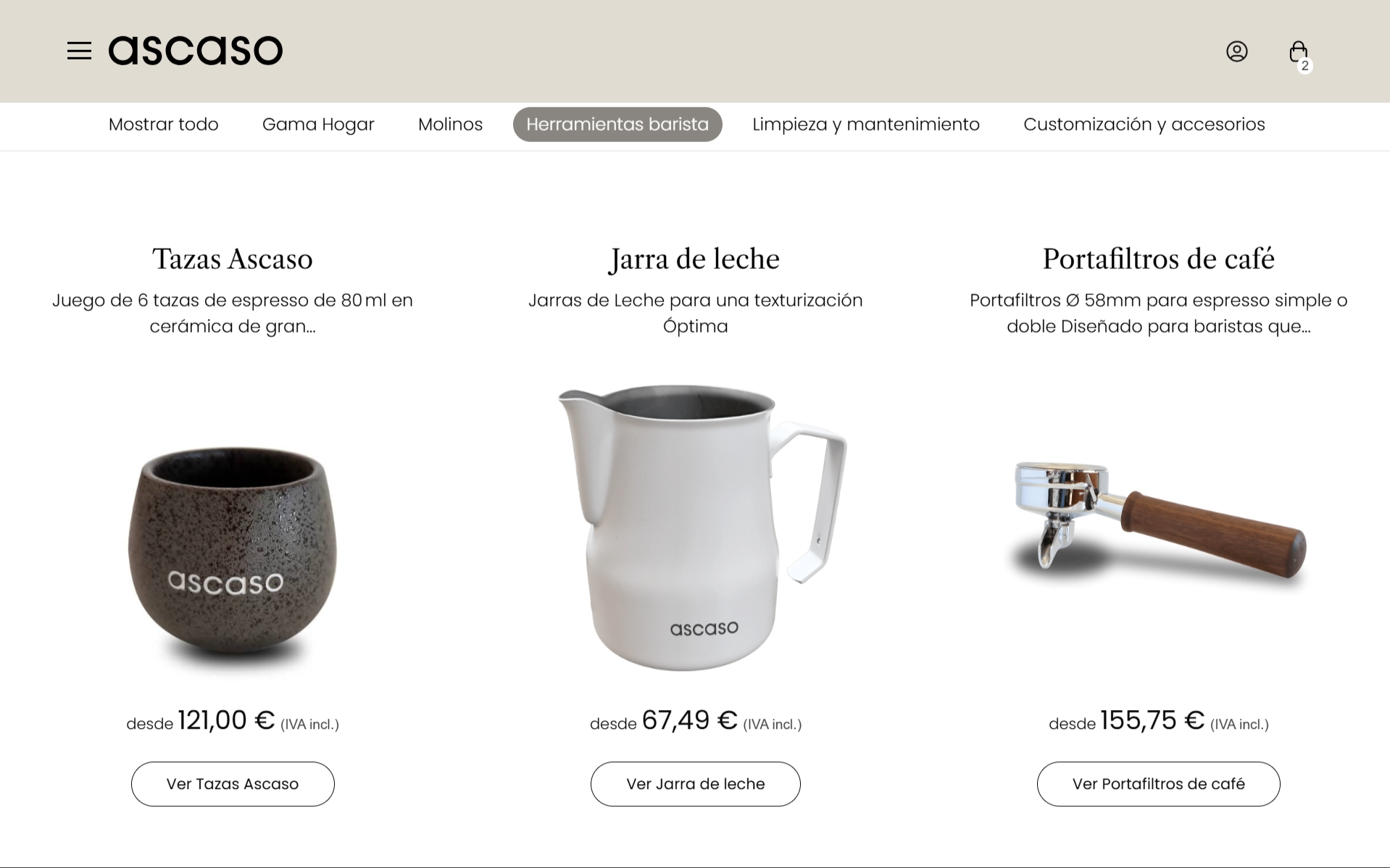
One of the main challenges was helping users navigate a broad product catalogue while understanding the differences between machines, accessories and complementary products.

To create a more intuitive experience, I restructured the information architecture, defining clearer navigation paths, product groupings and content relationships.

The goal was to reduce cognitive load and help users find the right product more efficiently.

Final design

Designing a premium shopping experience for coffee enthusiasts.

KEY DESIGN

DECISIONS

Editorial Product Presentation

Leading brands use large imagery and thoughtful composition to highlight product craftsmanship and reinforce premium positioning.

Clear Product Hierarchy

Information is prioritised to help users quickly understand product differences, features and value.

Minimal Purchasing Experience

Reducing unnecessary visual elements helps users focus on decision-making and product exploration.

Premium Product Storytelling

Large imagery, generous spacing and editorial layouts were used to highlight product craftsmanship and reinforce Ascaso's premium positioning.

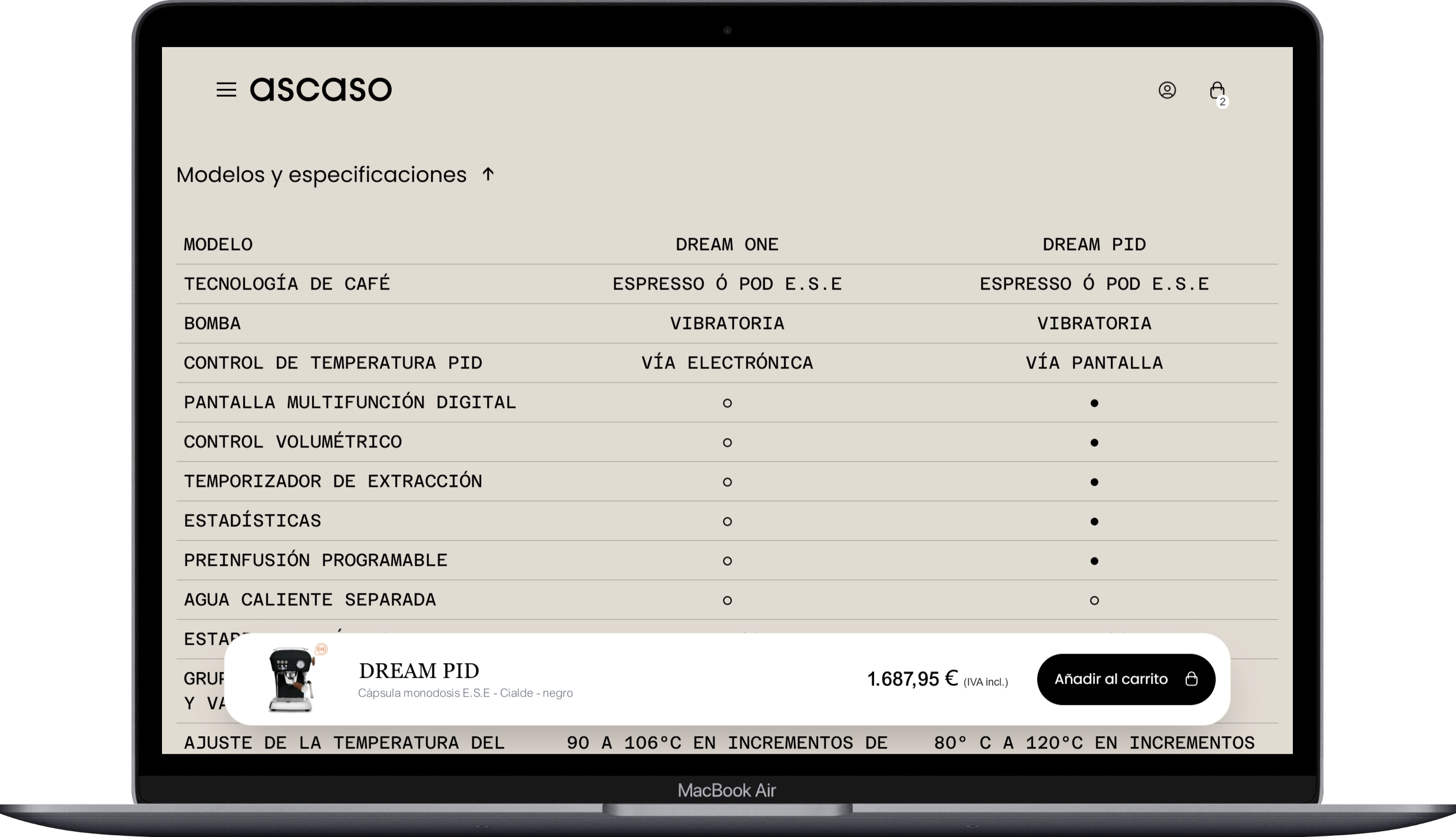
Clear Product Discovery

The catalogue structure was designed to help users quickly understand product categories and find the right machine for their needs.

PRODUCT CONFIGURATION

Users could explore different finishes and configurations while maintaining a simple and intuitive purchasing journey.

SMOOTH CHECKOUT EXPERIENCE

A simplified checkout flow reduces friction and allows users to complete their purchase through sign in, registration or guest checkout, creating a fast and intuitive purchasing experience.

IMPACT

The project transformed Ascaso’s digital ecosystem into a more cohesive shopping experience, improving product discovery, comparison and purchase confidence while preserving the brand’s premium character.

REFLECTIONS

This project demonstrated how thoughtful information architecture, clear product communication and strong visual storytelling can work together to create a more intuitive and engaging e-commerce experience.

another

proyects

To better understand industry standards and user expectations, I analysed a selection of premium e-commerce brands operating in adjacent and comparable markets.

EDUSPORT

Online education site focused on sports, and physical activity courses.

See Proyect

Educa Edtech Group

Design of the website for the online

education group Educa Edtech.

See Proyect

LETS´S CONNECT

Let´s build something

meaningful together.

Carlos Zubeldia

ECOMMERCE/ COFFEE SHOP

ascaso shop

About the project

Ascaso is a premium coffee machine manufacturer known for combining industrial craftsmanship, innovation and contemporary design.

The project focused on rethinking key areas of the e-commerce experience, with the goal of helping users better understand the product catalogue, compare models and make confident purchasing decisions while maintaining the brand’s premium positioning.

My Role

Product Designer

Duration

8 Weeks

Industry

E-commerce

What I worked on this project

UX Audit

Benchmarking

UI Design

Ecommerce

Information architecture

Visit the website

CHALLENGE

The existing experience provided access to a wide range of products, but users faced challenges when exploring the catalogue, comparing models and understanding the differences between product categories.

The goal was to simplify product discovery, improve navigation and create a clearer purchasing journey without compromising the premium perception of the brand.

Understanding Ascaso's Brand Ecosystem

Before designing the e-commerce experience, I analysed Ascaso’s existing digital ecosystem to understand how the brand communicated its values, products and positioning across different touchpoints.

The analysis focused on identifying recurring visual patterns, navigation structures, content hierarchy and brand attributes that could be translated into the shopping experience.

This phase helped establish a clear connection between the corporate website and the future e-commerce platform, ensuring consistency while adapting the experience to the specific needs of online purchasing.

01. TYPOGRAPHY

For the coffee lovers,

since 1962.

There are things that cannot be described in words. Like the aroma of freshly ground coffee. Or the sensation evoked by a good design. It is a moment, an instant, a feeling, sometimes incomprehensible.

Libre Carson

Aa

Heading

Poppins

Aa

Text

02. COLOUR PALETTE

#E2DCD3

#4A94FF

#000000

#5A5A5A

Usage

70 %

Neutrals

25 %

Warms

5 %

Accent

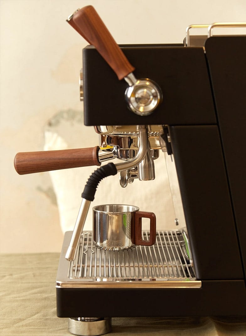
03. PRODUCT PHOTOGRAPHY
04. LAYOUT & COMPOSITION

05. NAVIGATION PATTERNS

06. UI COMPONETS

BARISTA

Our coffee machines combine tradition and

modernity, crafted specifically for coffee

enthusiasts who appreciate the art and ritual of

espresso making.

Go

Go

Go to STEEL

Go to STEEL

design

references

Learning from industry leaders and curated references.

To better understand user expectations and identify proven interaction patterns, I analysed a selection of e-commerce experiences recommended by the client alongside additional references discovered during the research phase.

Rather than replicating existing solutions, the goal was to understand how leading brands approached product presentation, navigation and purchasing journeys. These insights helped shape key areas of the Ascaso experience while maintaining a visual language aligned with the brand's identity.

01

La Marzocco

www.lamarzocco.com

Product storytelling and homepage composition.

The visual hierarchy, use of large product imagery and editorial layout helped define the structure of the Ascaso e-commerce homepage.

This reference demonstrated how premium products can be presented through storytelling while maintaining a clear path to exploration and purchase.

02

Lelit

www.lelit.com

Product card structure, information hierarchy and colour selector interactions.

This reference provided valuable insights into how technical products can be organised and compared efficiently.

The product card layout, content prioritisation and colour selection patterns inspired several interaction decisions within the catalogue experience.

03

Create

https://www.create-store.com/es/

Minimal product presentation and clean purchasing experience.

Create's approach demonstrated how a reduced visual language can help users focus on the product itself.

The product detail page became a key reference for simplifying information, reducing visual noise and creating a more intuitive shopping experience.

KEY FINDINGS

01

Editorial Product Presentation

Leading brands use large imagery and thoughtful composition to highlight product craftsmanship and reinforce premium positioning.

02

Clear Product Hierarchy

Information is prioritised to help users quickly understand product differences, features and value.

03

Minimal Purchasing Experience

Reducing unnecessary visual elements helps users focus on decision-making and product exploration.

04

Focused Product Storytelling

Every touchpoint contributes to communicating the brand's values through content, visuals and interaction design.

Information

Architecture

Organising a complex catalogue into a clearer shopping experience.

One of the main challenges was helping users navigate a broad product catalogue while understanding the differences between machines, accessories and complementary products.

To create a more intuitive experience, I restructured the information architecture, defining clearer navigation paths, product groupings and content relationships.

The goal was to reduce cognitive load and help users find the right product more efficiently.

Final

design

Designing a premium shopping experience for coffee enthusiasts.

KEY DESIGN

DECISIONS

Editorial Product Presentation

Leading brands use large imagery and thoughtful composition to highlight product craftsmanship and reinforce premium positioning.

Clear Product Hierarchy

Information is prioritised to help users quickly understand product differences, features and value.

Minimal Purchasing Experience

Reducing unnecessary visual elements helps users focus on decision-making and product exploration.

Premium Product Storytelling

Large imagery, generous spacing and editorial layouts were used to highlight product craftsmanship and reinforce Ascaso's premium positioning.

Clear Product Discovery

The catalogue structure was designed to help users quickly understand product categories and find the right machine for their needs.

PRODUCT CONFIGURATION

Users could explore different finishes and configurations while maintaining a simple and intuitive purchasing journey.

SMOOTH CHECKOUT EXPERIENCE

A simplified checkout flow reduces friction and allows users to complete their purchase through sign in, registration or guest checkout, creating a fast and intuitive purchasing experience.

IMPACT

The project transformed Ascaso’s digital ecosystem into a more cohesive shopping experience, improving product discovery, comparison and purchase confidence while preserving the brand’s premium character.

REFLECTIONS

This project demonstrated how thoughtful information architecture, clear product communication and strong visual storytelling can work together to create a more intuitive and engaging e-commerce experience.

another

proyects

To better understand industry standards and user expectations, I analysed a selection of premium e-commerce brands operating in adjacent and comparable markets.

EDUSPORT

Online education site focused on sports, and physical activity courses.

See Proyect

Educa Edtech Group

Design of the website for the online education group Educa Edtech.

See Proyect

LETS´S CONNECT

Let´s build something

meaningful together.

Carlos

Zubeldia

ECOMMERCE/ COFFEE SHOP

ascaso shop

About the project

Ascaso is a premium coffee machine manufacturer known for combining industrial craftsmanship, innovation and contemporary design.

The project focused on rethinking key areas of the e-commerce experience, with the goal of helping users better understand the product catalogue, compare models and make confident purchasing decisions while maintaining the brand’s premium positioning.

My Role

Product Designer

Duration

8 Weeks

Industry

E-commerce

What I worked on this project

UX Audit

Benchmarking

UI Design

Ecommerce

Information architecture

Visit the website

CHALLENGE

The existing experience provided access to a wide range of products, but users faced challenges when exploring the catalogue, comparing models and understanding the differences between product categories.

The goal was to simplify product discovery, improve navigation and create a clearer purchasing journey without compromising the premium perception of the brand.

Understanding

Ascaso's Brand Ecosystem

Before designing the e-commerce experience, I analysed Ascaso’s existing digital ecosystem to understand how the brand communicated its values, products and positioning across different touchpoints.

The analysis focused on identifying recurring visual patterns, navigation structures, content hierarchy and brand attributes that could be translated into the shopping experience.

This phase helped establish a clear connection between the corporate website and the future e-commerce platform, ensuring consistency while adapting the experience to the specific needs of online purchasing.

01. TYPOGRAPHY

For the coffee lovers,

since 1962.

There are things that cannot be described in words. Like the aroma of freshly ground coffee. Or the sensation evoked by a good design. It is a moment, an instant, a feeling, sometimes incomprehensible.

Libre Carson

Aa

Heading

Poppins

Aa

Text

02. COLOUR PALETTE

#E2DCD3

#4A94FF

#000000

#5A5A5A

Usage

70 %

Neutrals

25 %

Warms

5 %

Accent

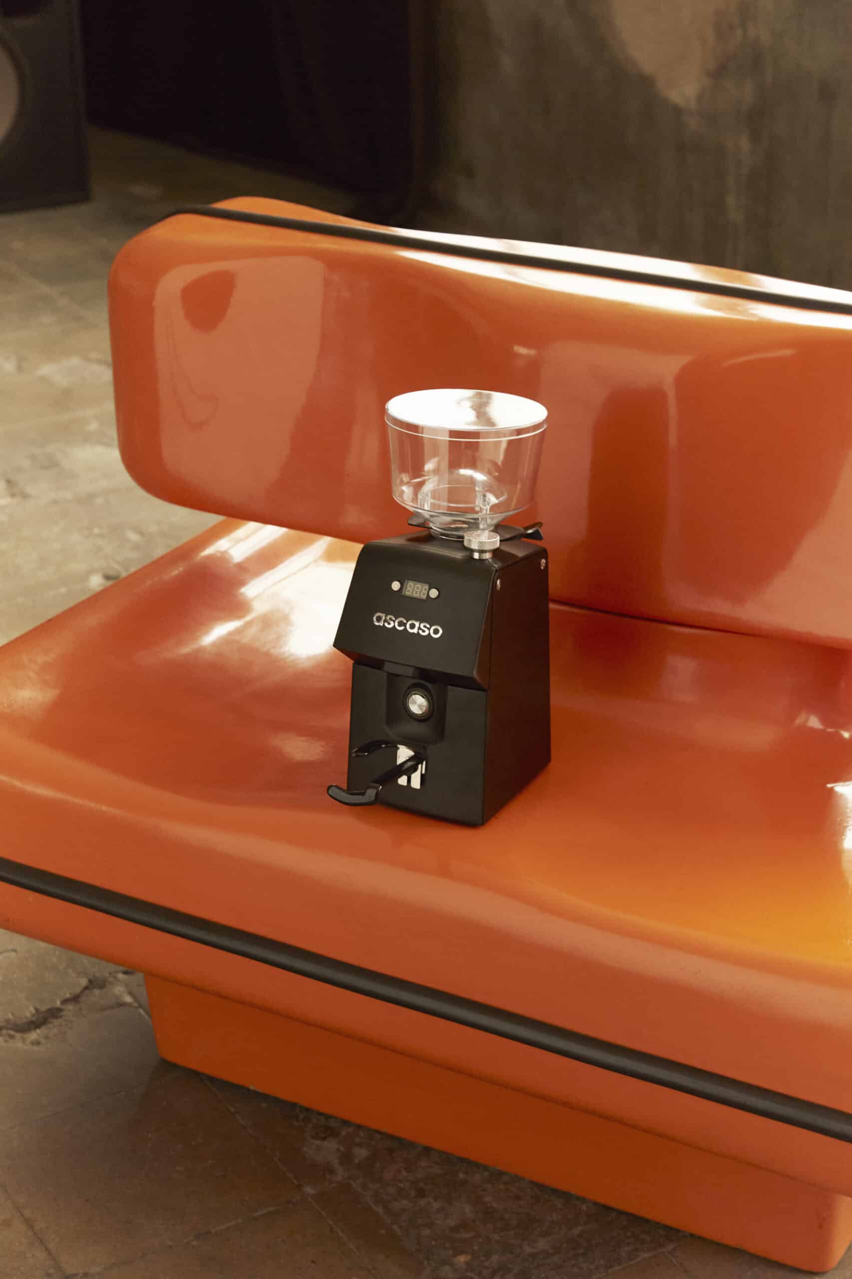
03. PRODUCT PHOTOGRAPHY
04. LAYOUT & COMPOSITION

05. NAVIGATION PATTERNS

06. UI COMPONETS

BARISTA

Our coffee machines combine tradition and

modernity, crafted specifically for coffee

enthusiasts who appreciate the art and ritual of

espresso making.

Go

Go
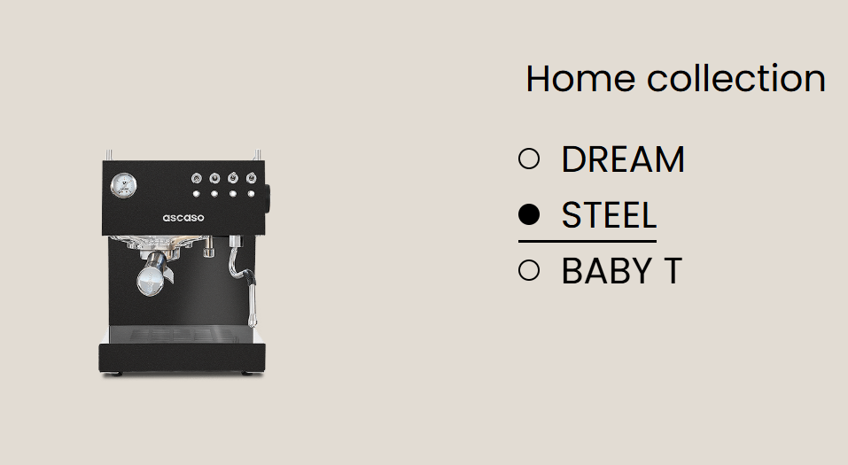
Go to STEEL

Go to STEEL

design

references

Learning from industry leaders and curated references.

To better understand user expectations and identify proven interaction patterns, I analysed a selection of e-commerce experiences recommended by the client alongside additional references discovered during the research phase.

Rather than replicating existing solutions, the goal was to understand how leading brands approached product presentation, navigation and purchasing journeys. These insights helped shape key areas of the Ascaso experience while maintaining a visual language aligned with the brand's identity.

01

La Marzocco

www.lamarzocco.com

Product storytelling and homepage composition.

The visual hierarchy, use of large product imagery and editorial layout helped define the structure of the Ascaso e-commerce homepage.

This reference demonstrated how premium products can be presented through storytelling while maintaining a clear path to exploration and purchase.

02

Lelit

www.lelit.com

Product card structure, information hierarchy and colour selector interactions.

This reference provided valuable insights into how technical products can be organised and compared efficiently.

The product card layout, content prioritisation and colour selection patterns inspired several interaction decisions within the catalogue experience.

03

Create

https://www.create-store.com/es/

Minimal product presentation and clean purchasing experience.

Create's approach demonstrated how a reduced visual language can help users focus on the product itself.

The product detail page became a key reference for simplifying information, reducing visual noise and creating a more intuitive shopping experience.

KEY FINDINGS

01

Editorial Product Presentation

Leading brands use large imagery and thoughtful composition to highlight product craftsmanship and reinforce premium positioning.

02

Clear Product Hierarchy

Information is prioritised to help users quickly understand product differences, features and value.

03

Minimal Purchasing Experience

Reducing unnecessary visual elements helps users focus on decision-making and product exploration.

04

Focused Product Storytelling

Every touchpoint contributes to communicating the brand's values through content, visuals and interaction design.

Information

Architecture

Organising a complex catalogue into a clearer shopping experience.

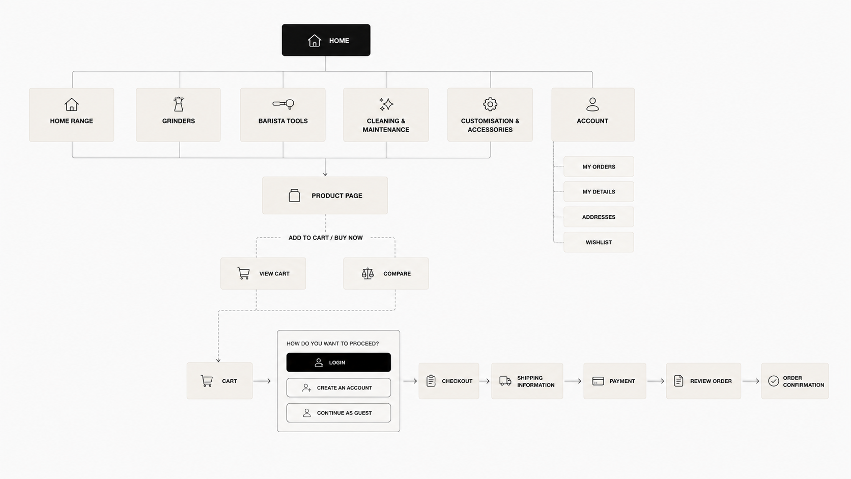
One of the main challenges was helping users navigate a broad product catalogue while understanding the differences between machines, accessories and complementary products.

To create a more intuitive experience, I restructured the information architecture, defining clearer navigation paths, product groupings and content relationships.

The goal was to reduce cognitive load and help users find the right product more efficiently.
Final

design

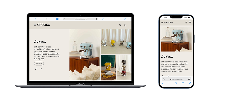
Designing a premium shopping experience for coffee enthusiasts.
KEY DESIGN

DECISIONS

Editorial Product Presentation

Leading brands use large imagery and thoughtful composition to highlight product craftsmanship and reinforce premium positioning.

Clear Product Hierarchy

Information is prioritised to help users quickly understand product differences, features and value.

Minimal Purchasing Experience

Reducing unnecessary visual elements helps users focus on decision-making and product exploration.

Premium Product Storytelling

Large imagery, generous spacing and editorial layouts were used to highlight product craftsmanship and reinforce Ascaso's premium positioning.
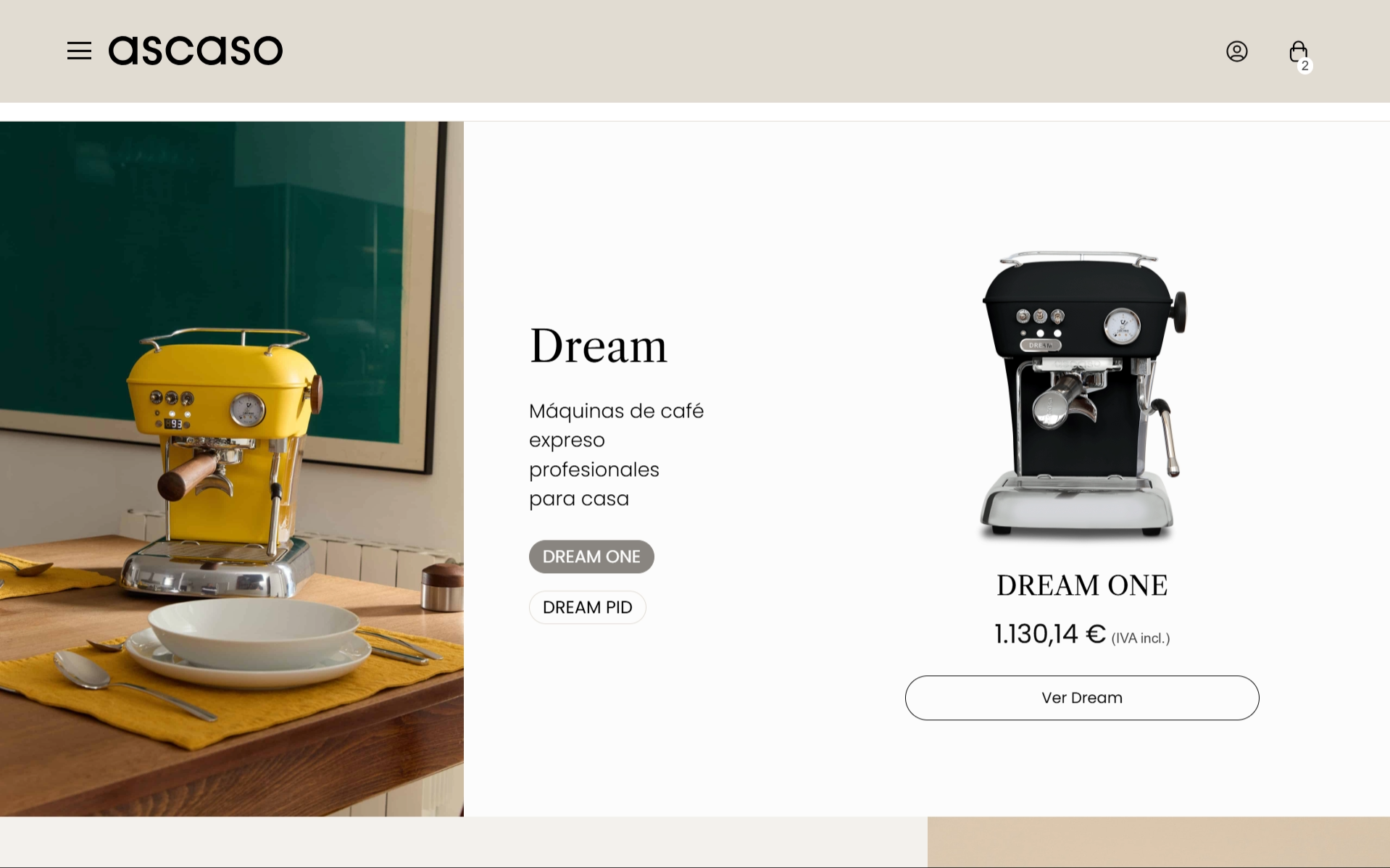
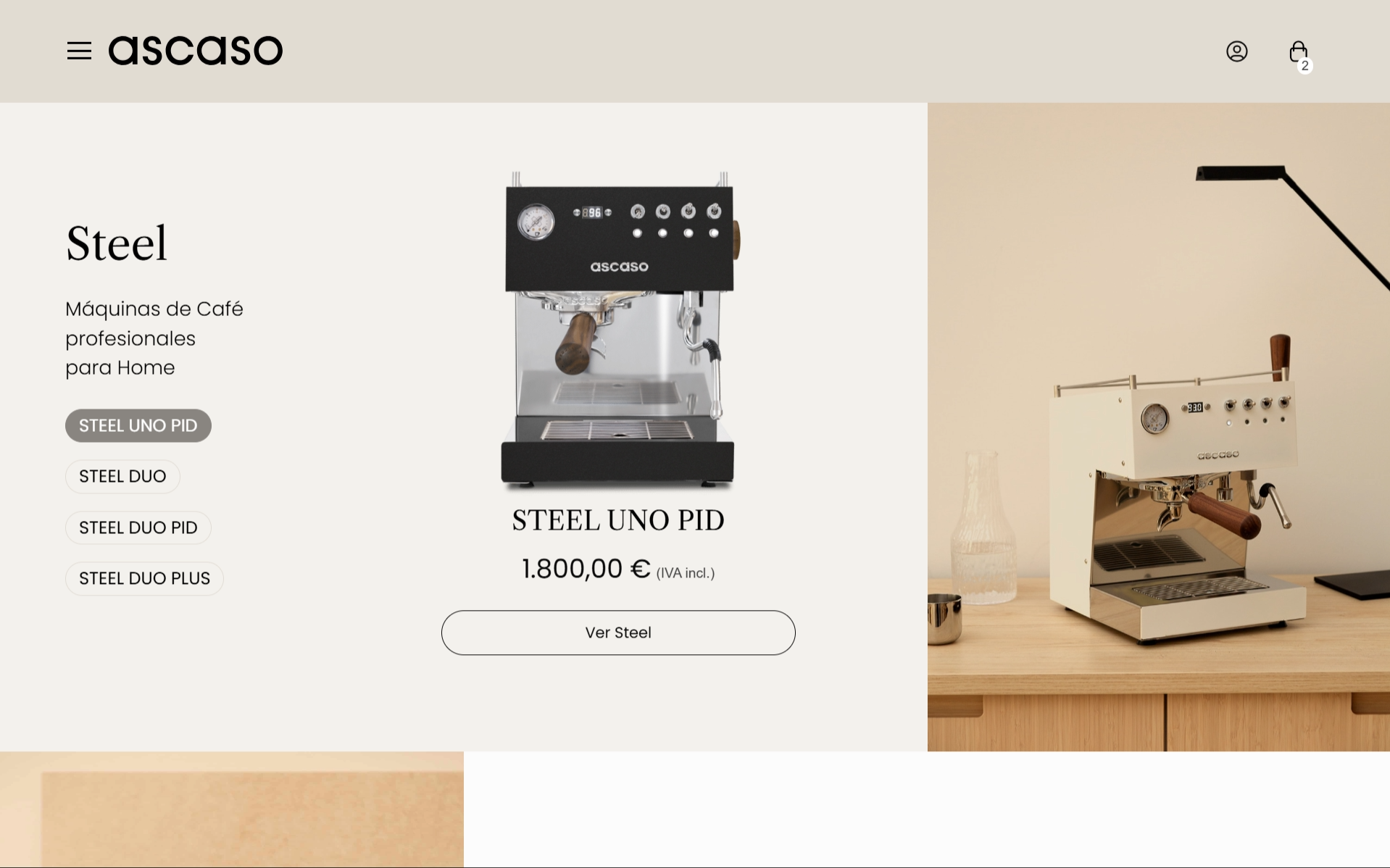
Clear Product Discovery

The catalogue structure was designed to help users quickly understand product categories and find the right machine for their needs.
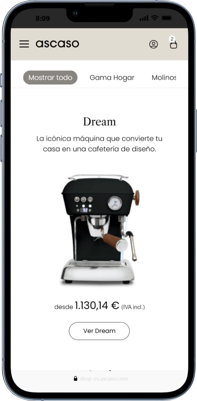
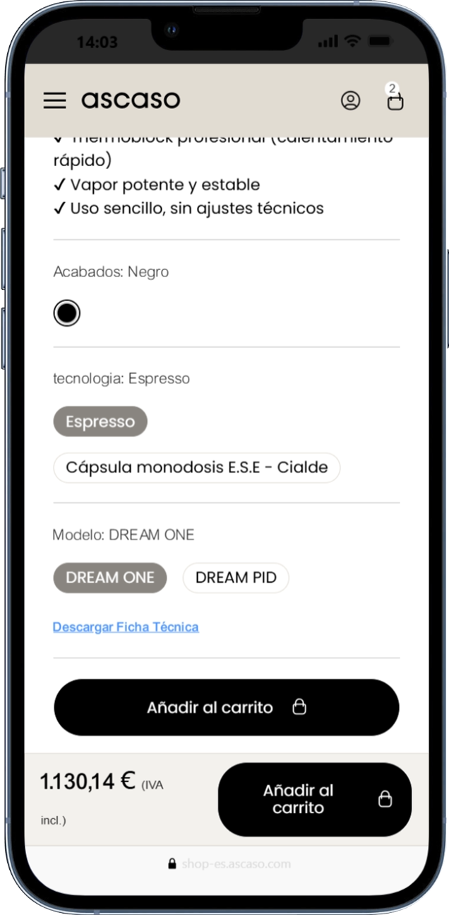
PRODUCT CONFIGURATION

Users could explore different finishes and configurations while maintaining a simple and intuitive purchasing journey.
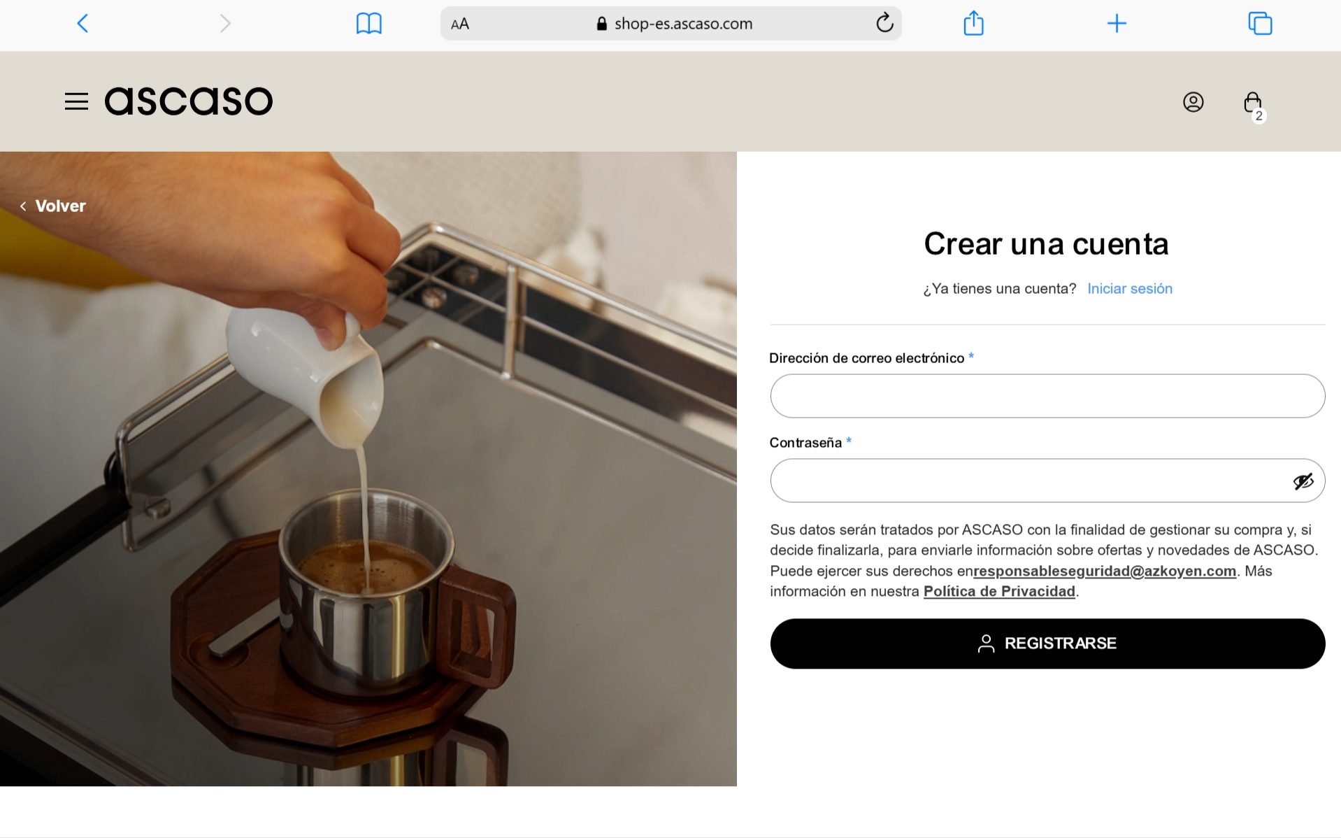
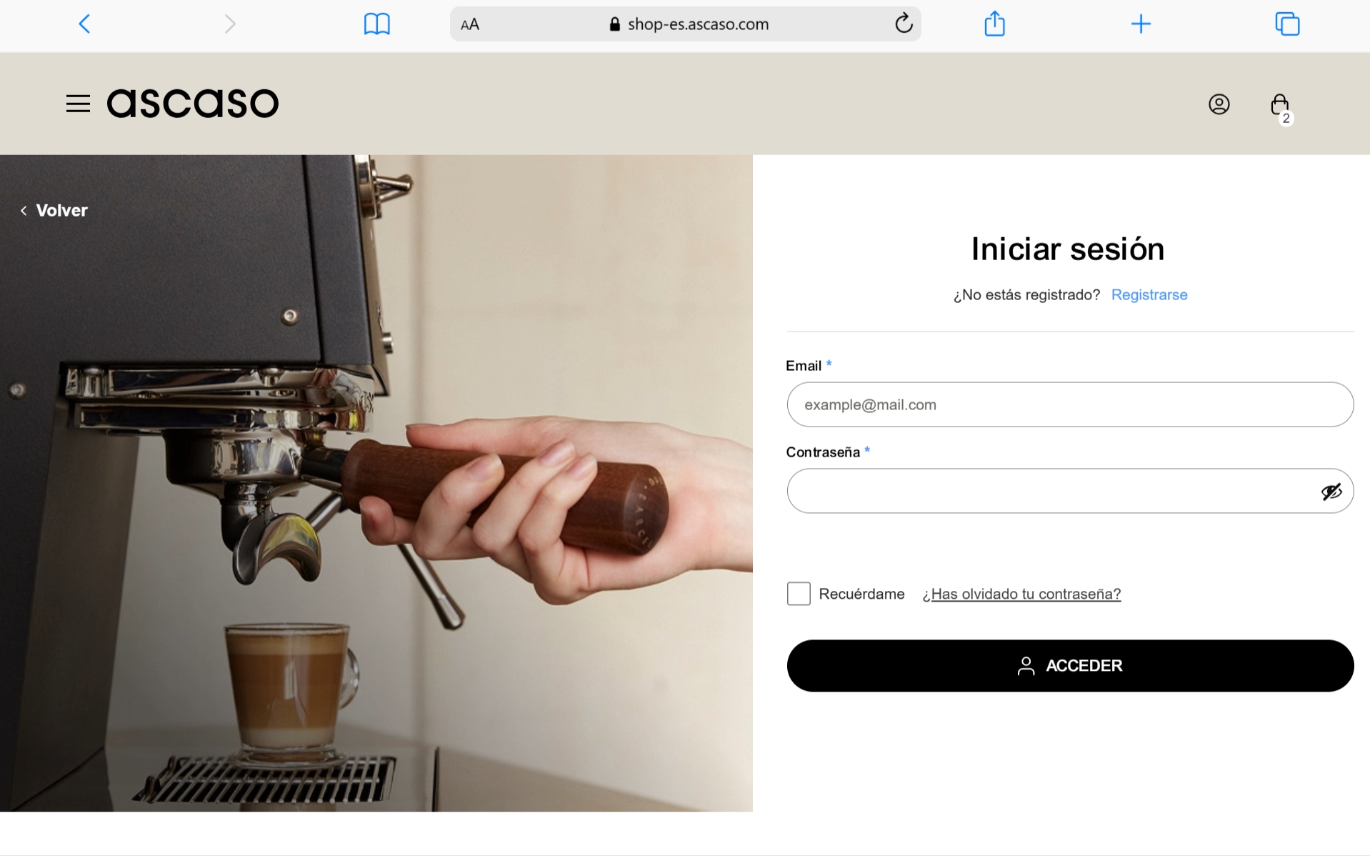
SMOOTH CHECKOUT EXPERIENCE

A simplified checkout flow reduces friction and allows users to complete their purchase through sign in, registration or guest checkout, creating a fast and intuitive purchasing experience.
IMPACT

The project transformed Ascaso’s digital ecosystem into a more cohesive shopping experience, improving product discovery, comparison and purchase confidence while preserving the brand’s premium character.

REFLECTIONS

This project demonstrated how thoughtful information architecture, clear product communication and strong visual storytelling can work together to create a more intuitive and engaging e-commerce experience.

another

proyects
To better understand industry standards and user expectations, I analysed a selection of premium e-commerce brands operating in adjacent and comparable markets.

EDUSPORT

Online education site focused on sports, and physical activity courses.

See Proyect

Educa Edtech Group

Design of the website for the online education group Educa Edtech.

See Proyect

LETS´S CONNECT

Let´s build something

meaningful together.

Carlos Zubeldia