ECOMMERCE / COFFEE SHOP
Creating a more intuitive and engaging e-commerce experience for coffee enthusiasts.
Altessia
About the project
Altessia is a specialised cardiology clinic dedicated to helping patients manage their cardiovascular health through every stage of their journey.
This project focused on redesigning the digital experience to better support patients in understanding their condition, exploring available treatments and accessing the resources needed for long-term care.
The work included UX audit, benchmark analysis, information architecture, wireframes and UI design across a two-month engagement.
My Role
Product Designer

Duration
6 Weeks
Industry
E-commerce
What I worked on this project
UX Audit
Benchmarking
UI Design
Information Architecture
Wireframes
Visit the website

CHALLENGE
Patients visiting Altessia were often looking for more than medical information. They needed guidance, clarity and reassurance throughout what is often a complex and emotional healthcare journey.
One of the main challenges was helping users understand which services were relevant to their condition, what steps to follow after diagnosis, and how to maintain a healthy lifestyle after treatment. While the clinic offered a wide range of specialised services and resources, the existing experience made it difficult for patients to understand how these elements connected throughout their care journey.
The goal was to transform the website into a clearer and more structured experience that could support patients from diagnosis and treatment to recovery and long-term cardiovascular wellbeing.
ux audit
The project began with a UX audit focused on understanding how patients interacted with the existing website and identifying opportunities to improve clarity, navigation and information access.
THE PATIENT JOURNEY

- TREATMENT
I want to know which treatments are available and how they work.

- DIAGNOSIS
I need to understand what is happening and what I need.

- RECOVERY
I need guidance during my recovery and rehabilitation.

- LONG-TERM CARE
I want to stay healthy and prevent future cardiovascular issues.
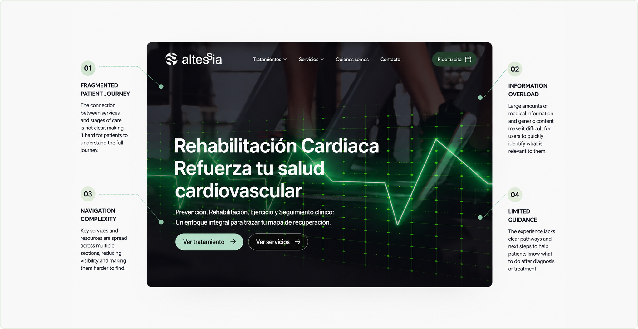

KEY FINDINGS
Patients need a clearer, more guided experience that connects information, services and support to each stage of their cardiovascular health journey.
Research & Inspiration
To design a more intuitive and supportive experience for Altessia patients, I analysed leading healthcare websites and digital platforms.
The research focused on how they structure information, guide patients throughout their healthcare journey and build trust through clarity, consistency and accessibility.
01
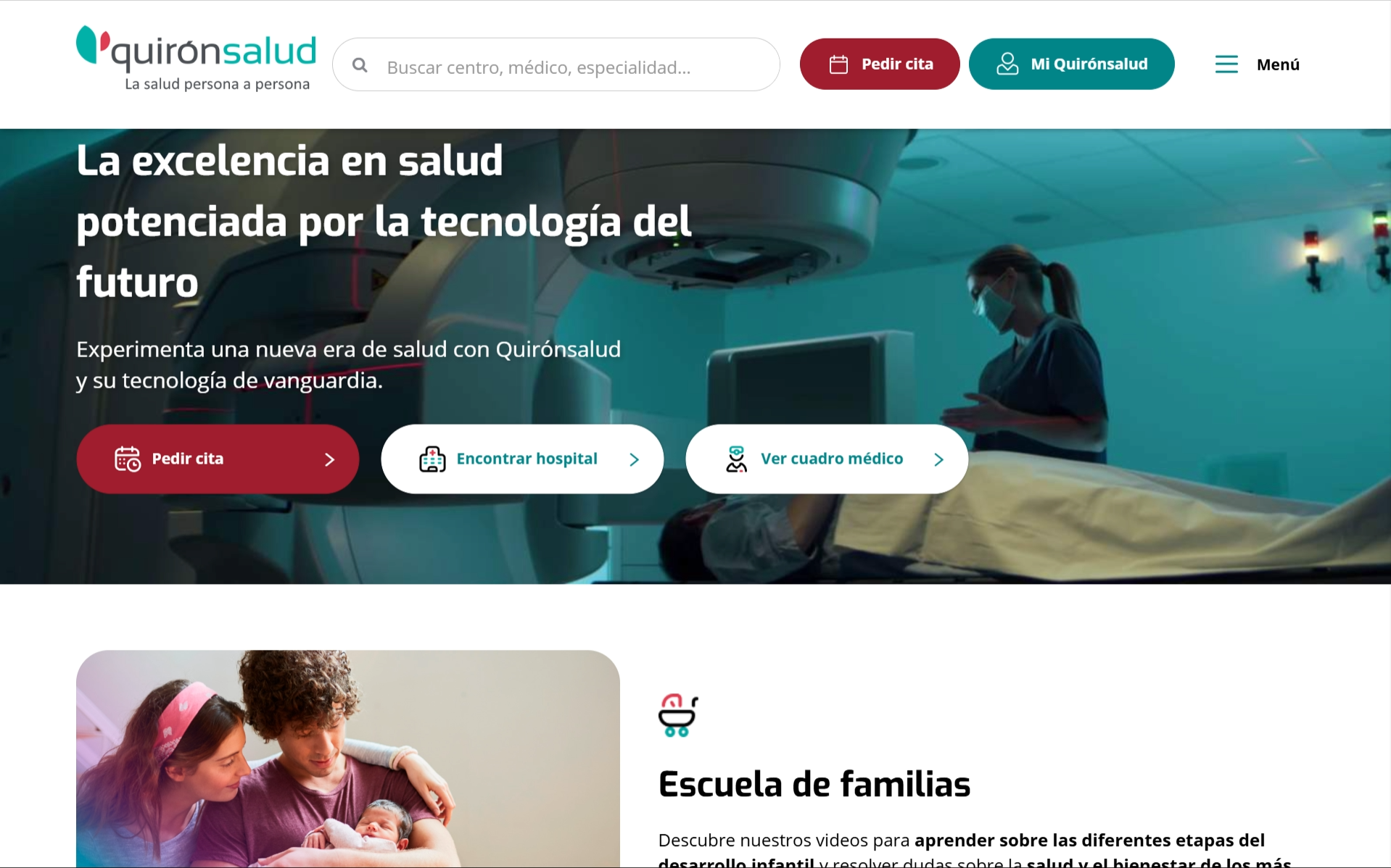
QuironSalud

Well-organised services and specialties that help users quickly identify the care they need while reducing navigation complexity.
02
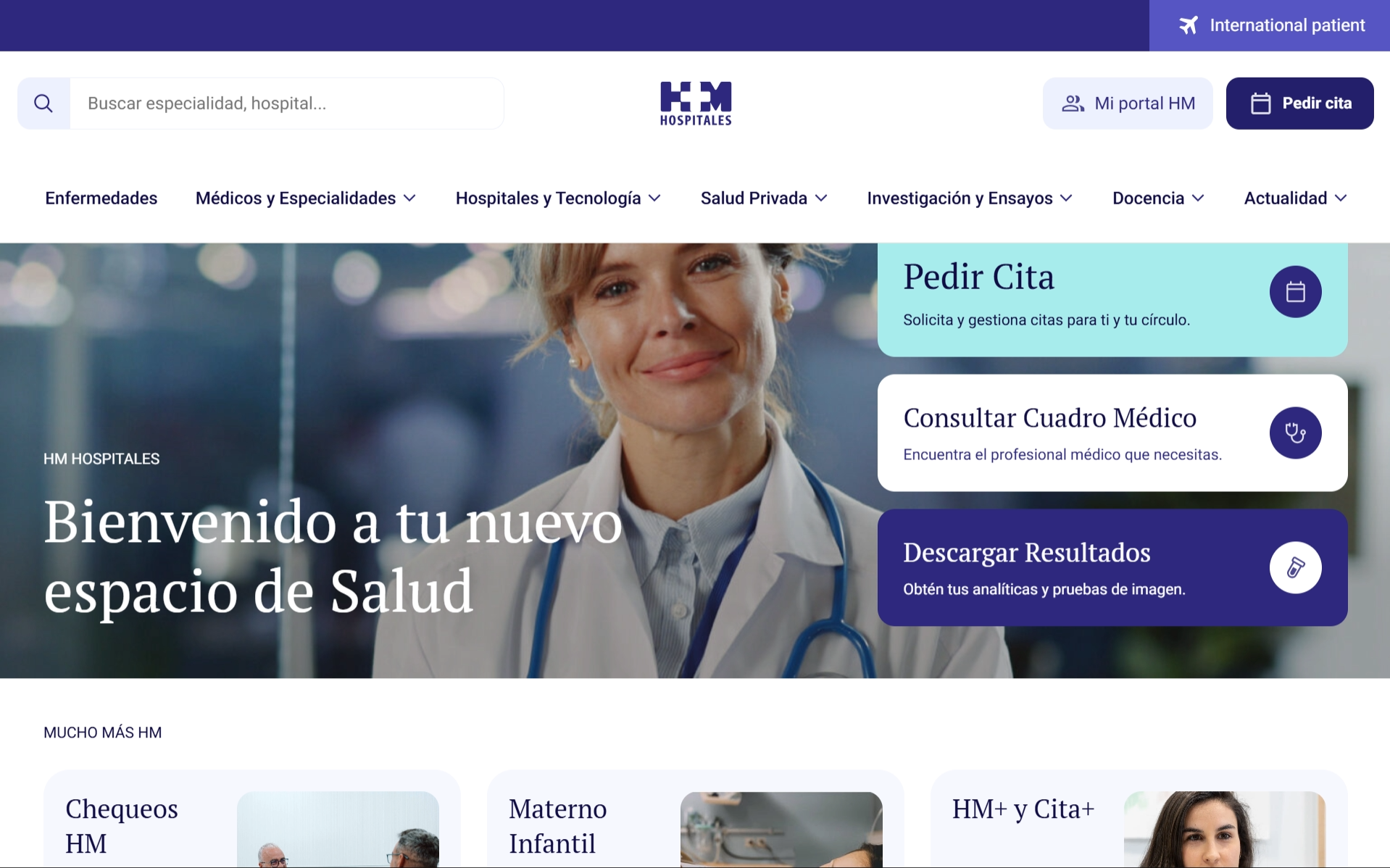
HM hospitales
Transparent communication, specialist visibility and intuitive appointment flows that reinforce confidence throughout the patient journey.
03
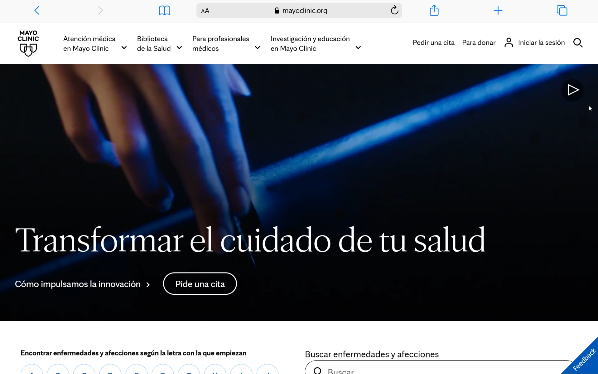
Mayo Clinic
Clear content hierarchy and educational resources that simplify complex medical information and help patients understand every stage of their care.
KEY FINDINGS

01
Clear Patient Pathways
Guide patients through each stage of care with clear navigation, contextual information and visible next steps.
02
Accessible Information
Prioritise content through strong information hierarchy to make complex medical topics easier to understand.
03
Build Trust Through Transparency
Clear service descriptions, specialist information and consistent communication help patients feel informed and confident.
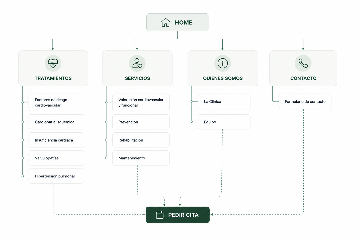
Information Architecture
Designing a clearer path through the patient's journey.
The navigation was redesigned to simplify decision-making and reduce cognitive load. Instead of organising information around the clinic's structure, the new architecture follows the questions patients naturally ask during their healthcare journey.
This approach makes treatments, services and supporting resources easier to discover while creating a more intuitive path towards the website's primary goal: booking an appointment.
Design Principles
Before designing the e-commerce experience, I analysed Ascaso’s existing digital ecosystem to understand how the brand communicated its values, products and positioning across different touchpoints.
The analysis focused on identifying recurring visual patterns, navigation structures, content hierarchy and brand attributes that could be translated into the shopping experience.
This phase helped establish a clear connection between the corporate website and the future e-commerce platform, ensuring consistency while adapting the experience to the specific needs of online purchasing.

typography

Switzer
Aa
Display
¿Qué patologías tratamos en Altessia?
Outfit
Aa
Text
En Altessia tratamos de forma especializada las principales patologías cardiovasculares, desde el riesgo cardiovascular hasta enfermedades como la cardiopatía isquémica o la insuficiencia cardíaca.

colour palette
#294133
#5B776B
#B8E0CE
#000000
#FAFAFA

Soft green tones communicate care, reassurance and wellbeing while maintainning contrast and accessibility.

components

Ver tratamiento

Pide tu cita


gallery
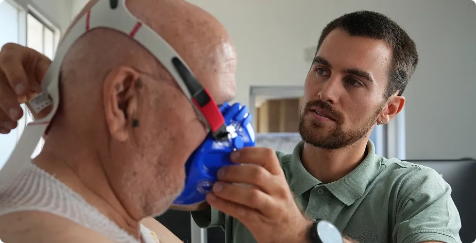
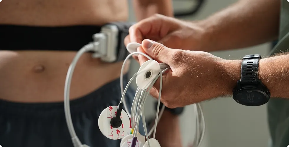
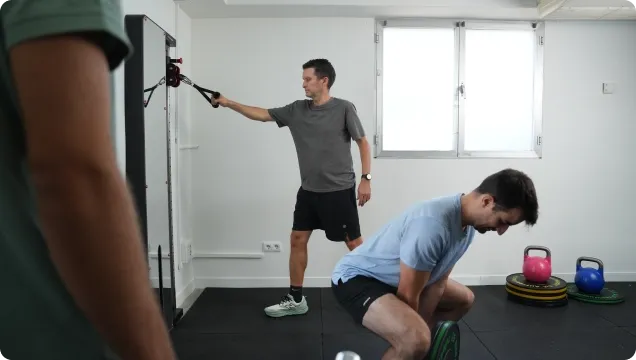
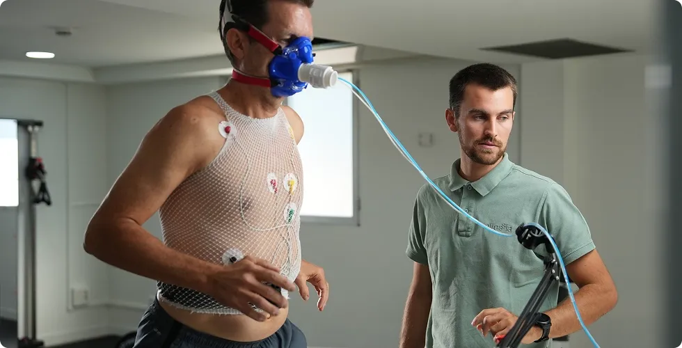
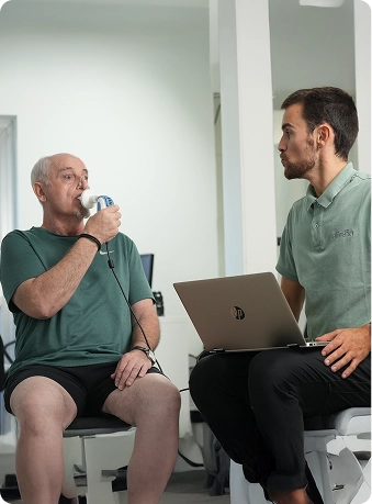
Photography focuses on real interactions between patients and healthcare professionals, reinforcing trust, personalised care and the rehabilitation journey.

accesibility & readability

High Contrast
Text and UI elements meet WCAG standards

Large Tap Areas
Buttons and interactive elements are sized for easy and confident use.

Readable Text
Body text is set at a comfortable size.

Generous Spacing
8 pt spacing system applied across layouts for clarity and rhythm.
Final design
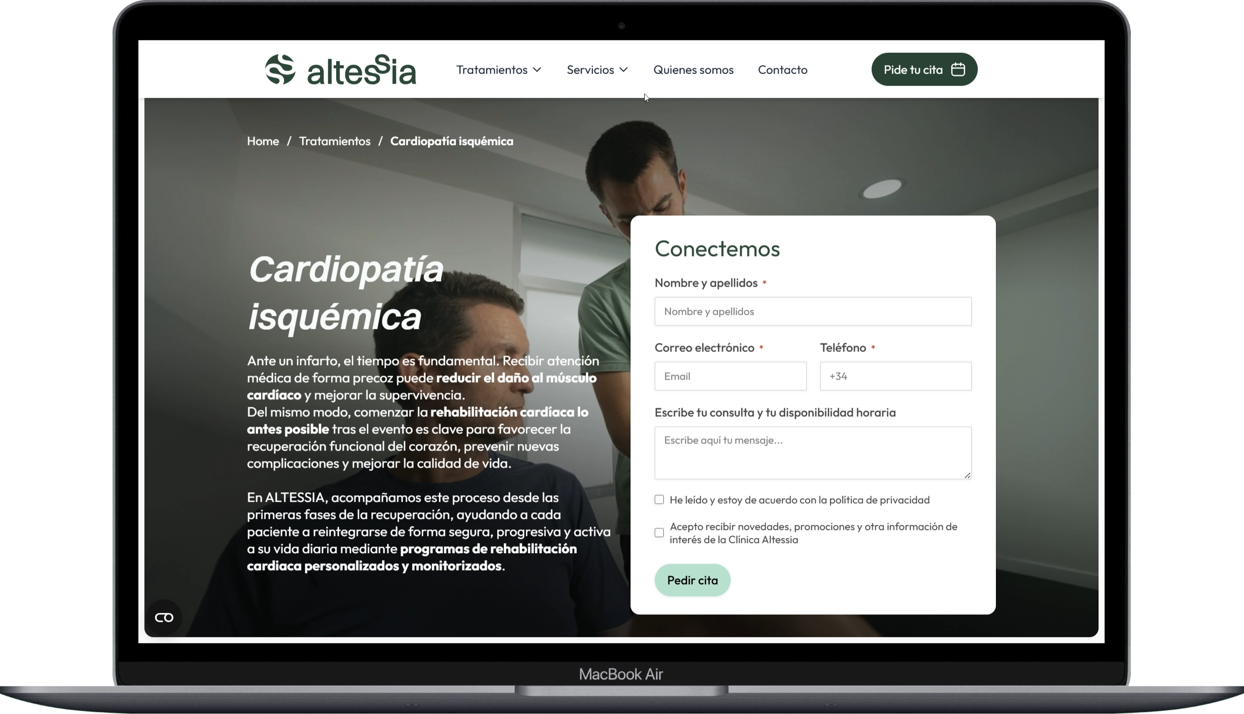
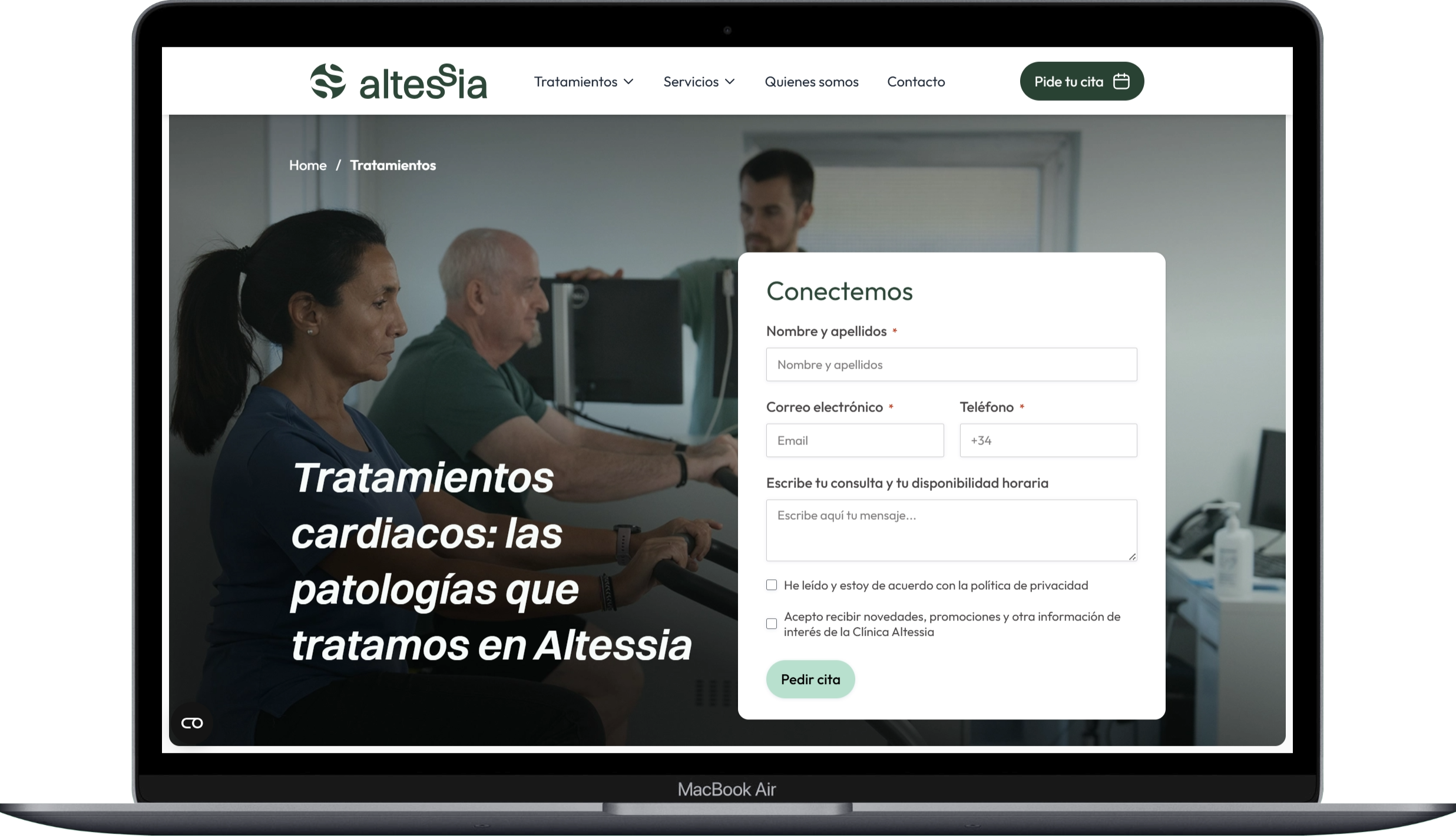
The final interface translates the research, UX audit and information architecture into a clear digital experience that helps patients understand their healthcare journey, discover relevant treatments and confidently take the next step.
KEY DESIGN DECISIONS


Patient Journey
Every interaction supports patients throughout their rehabilitation journey.

Human-Centred Care
Real professionals and authentic imagery build trust and confidence.

Clear Paths to Action
Simple navigation and clear CTAs encourage appointment requests.
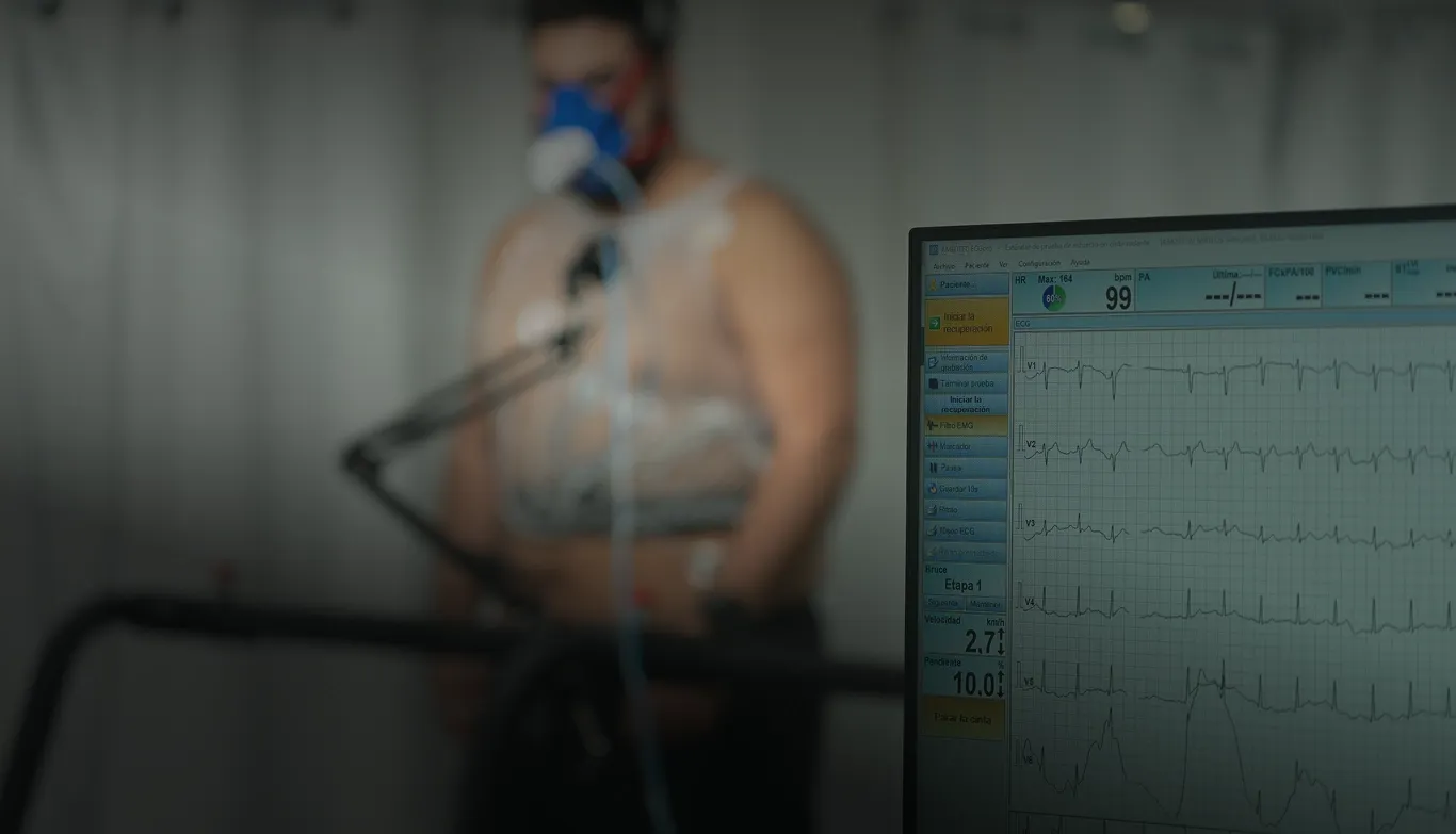
Inspiring the first steps
The homepage immediately connects physical activity with cardiovascular health, encouraging patients to take the first step towards prevention and rehabilitation.
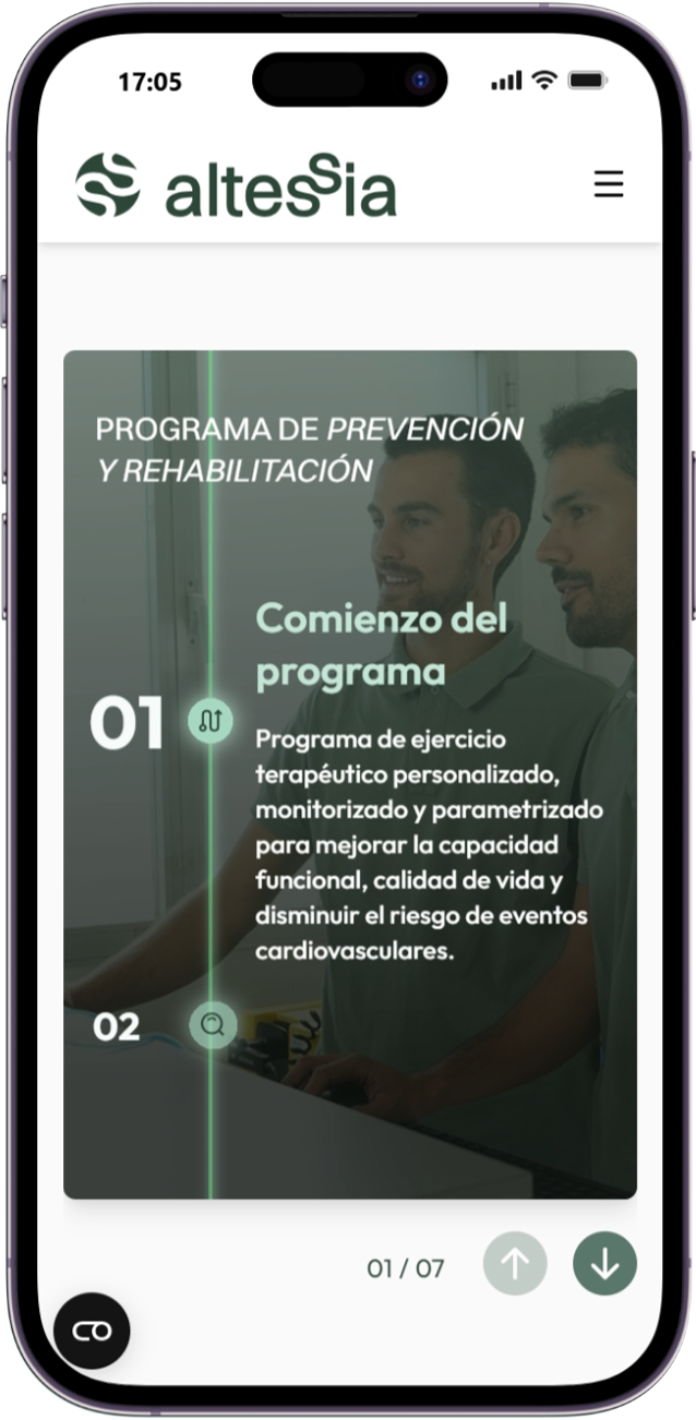
Guiding the rehabilitation journey
Rehabilitation is presented as a structured journey, helping patients understand each stage of the programme and what to expect throughout their recovery.
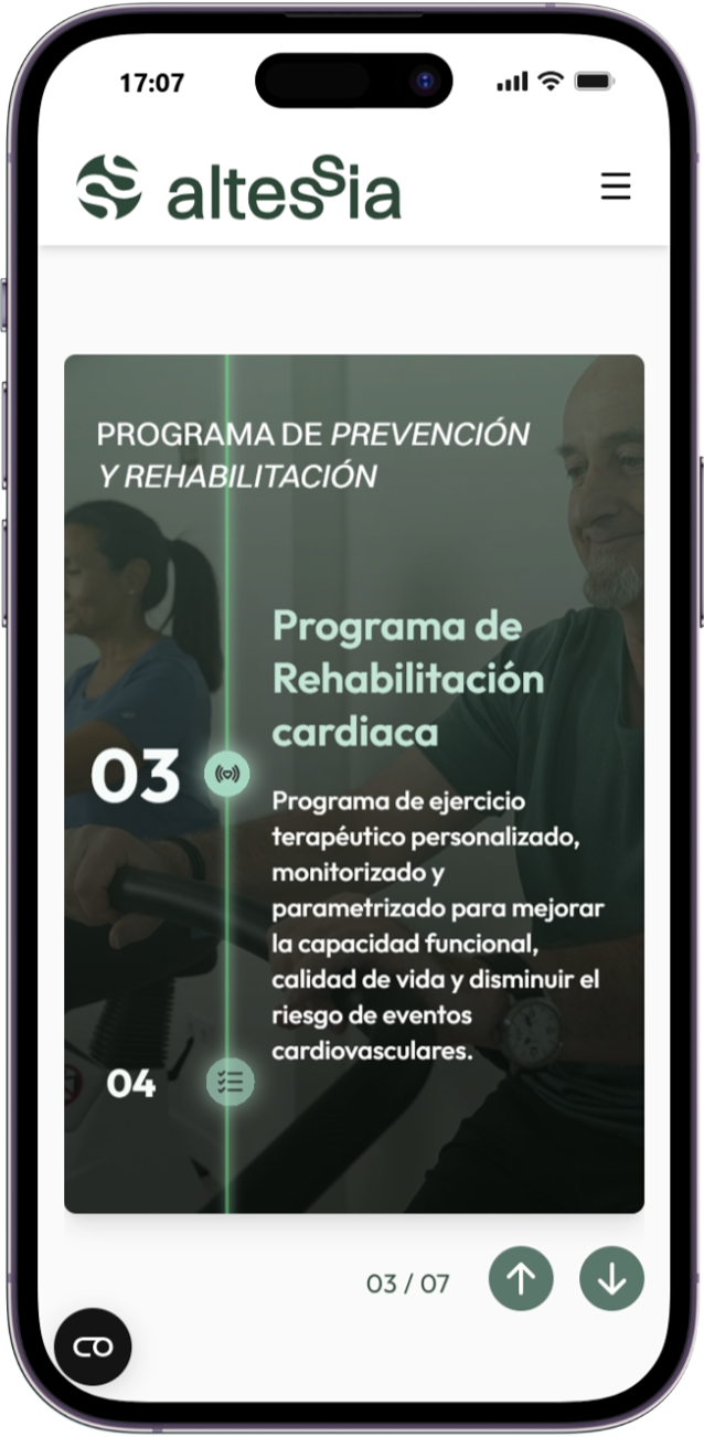
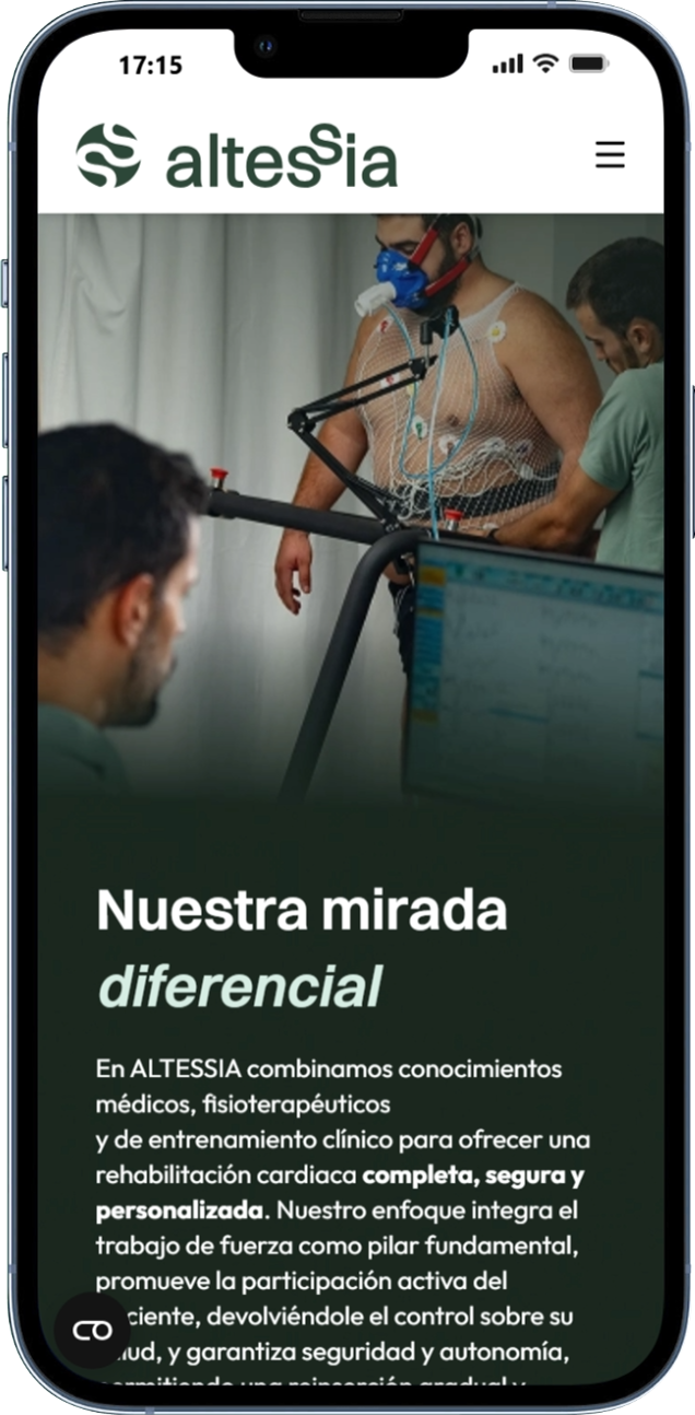
Humanising the treatment experience
Real professionals, authentic patient interactions and specialised equipment reinforce trust while making the rehabilitation process feel approachable and personal.
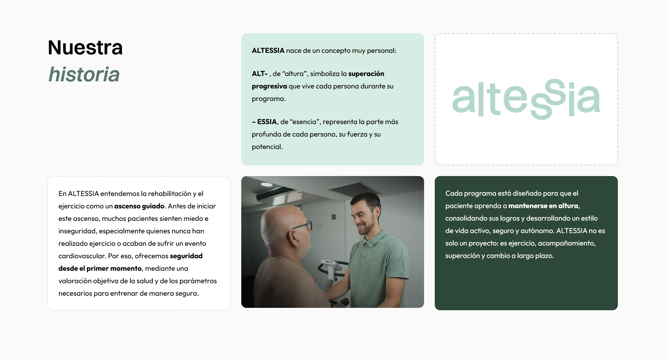
Building trust beyond treatment
Dedicated sections about the team, facilities and clinical philosophy help patients understand who will accompany them throughout their rehabilitation journey.
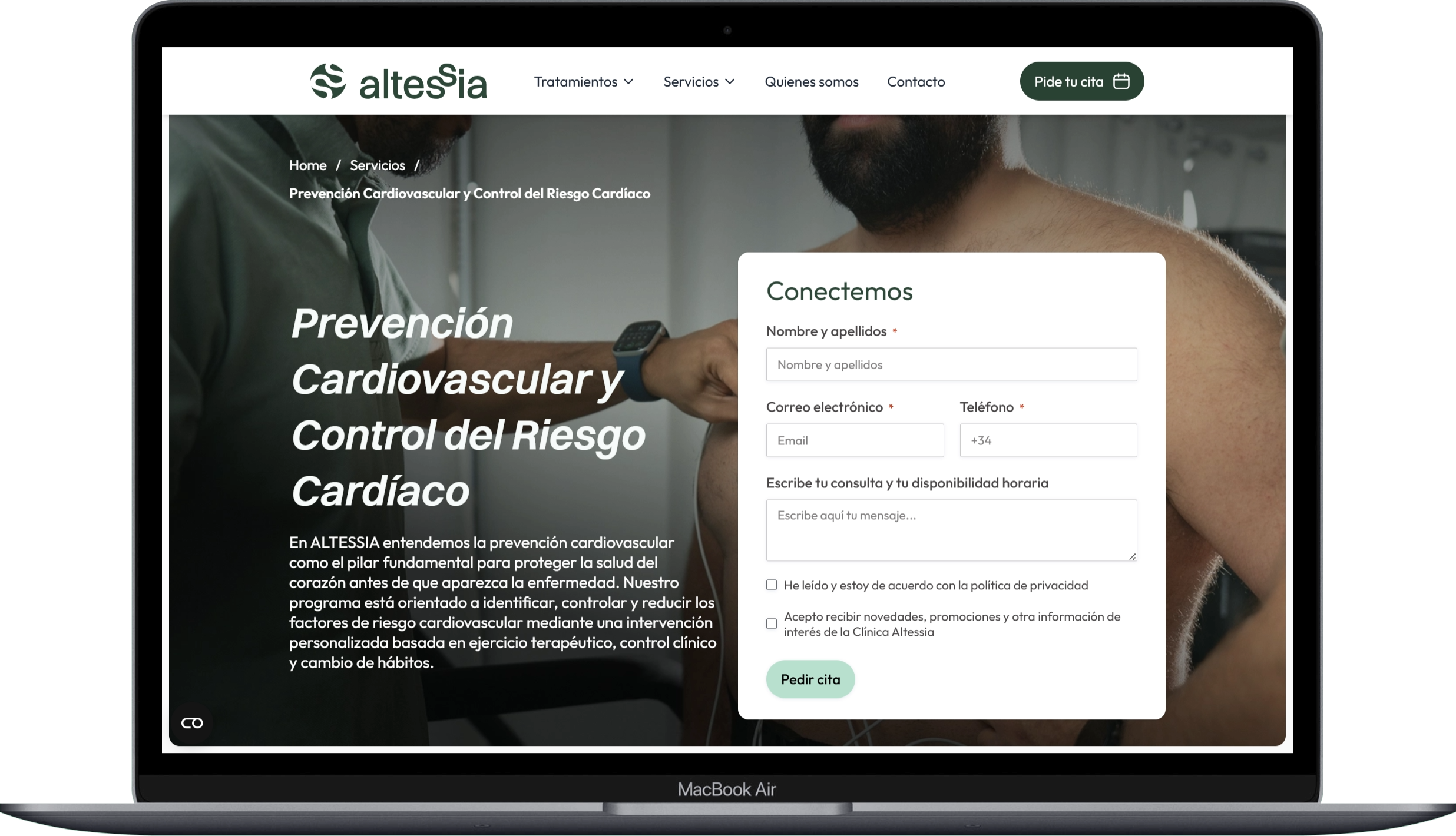
Encouraging appointment requests
Strategic calls to action are integrated across the experience, allowing patients to request an appointment naturally whenever
they feel ready.
IMPACT
To validate the new experience, I compared the redesigned patient journey against the initial UX audit findings. The restructured information architecture and clearer patient pathways directly addressed the navigation and comprehension issues identified at the start of the project, giving patients a more guided route from diagnosis to long-term care.
CONCLUTIONS
This project reinforced the importance of designing around real patient needs rather than internal clinic structure. By anchoring the experience in the patient journey — diagnosis, treatment, recovery and long-term care — the redesign helps patients feel informed and supported at every stage, while making it easier to take the next step towards booking an appointment.
another proyects
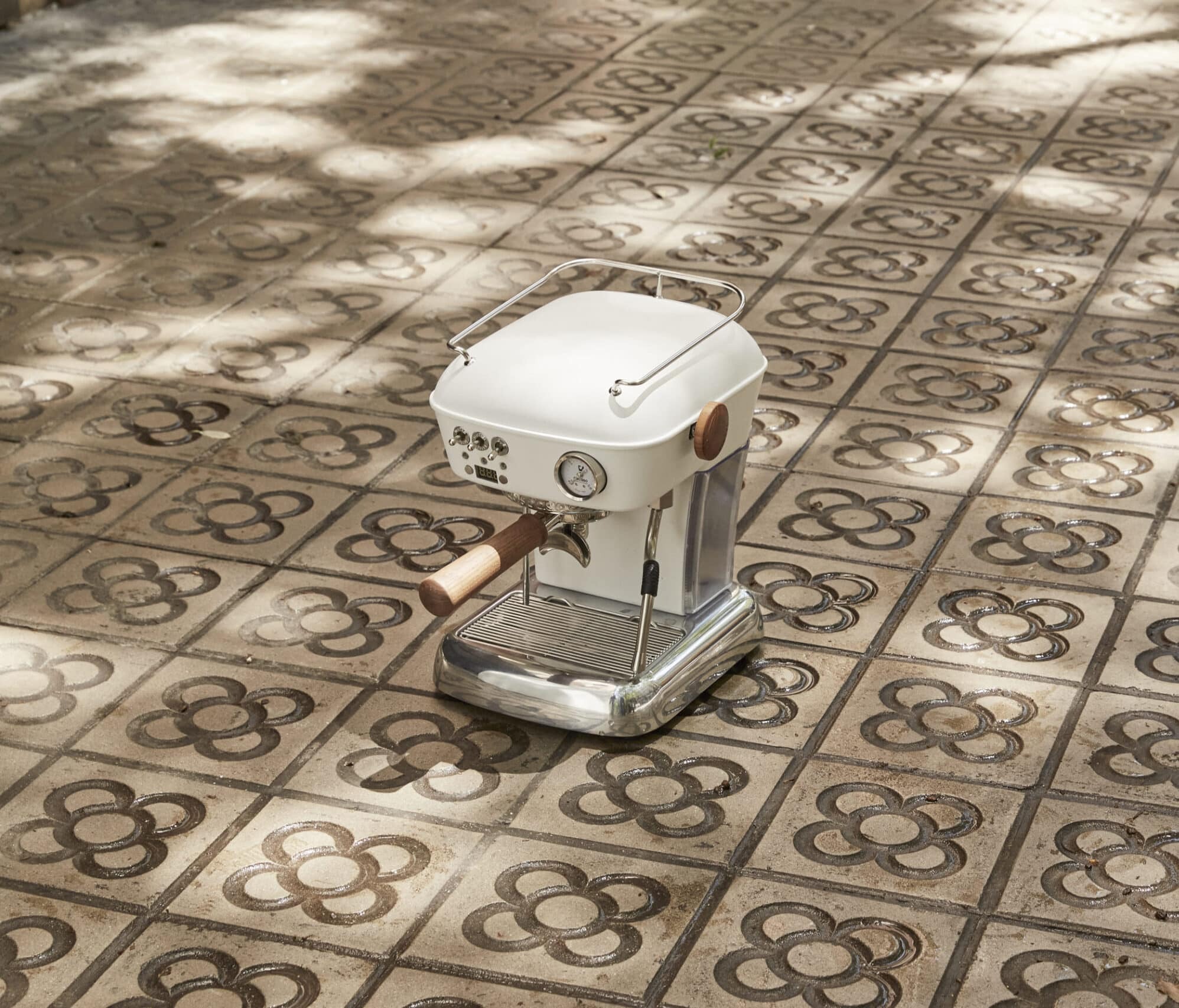

E-COMMERCE / COFFEE MACHINE
Creating a more intuitive and engaging e-commerce experience for coffee enthusiasts.
See Proyect

EDUSPORT
Online education site focused on sports, and physical activity courses.
See Proyect